Five things that make text hard to read
Dušan Jelesijević13 Nov 2026
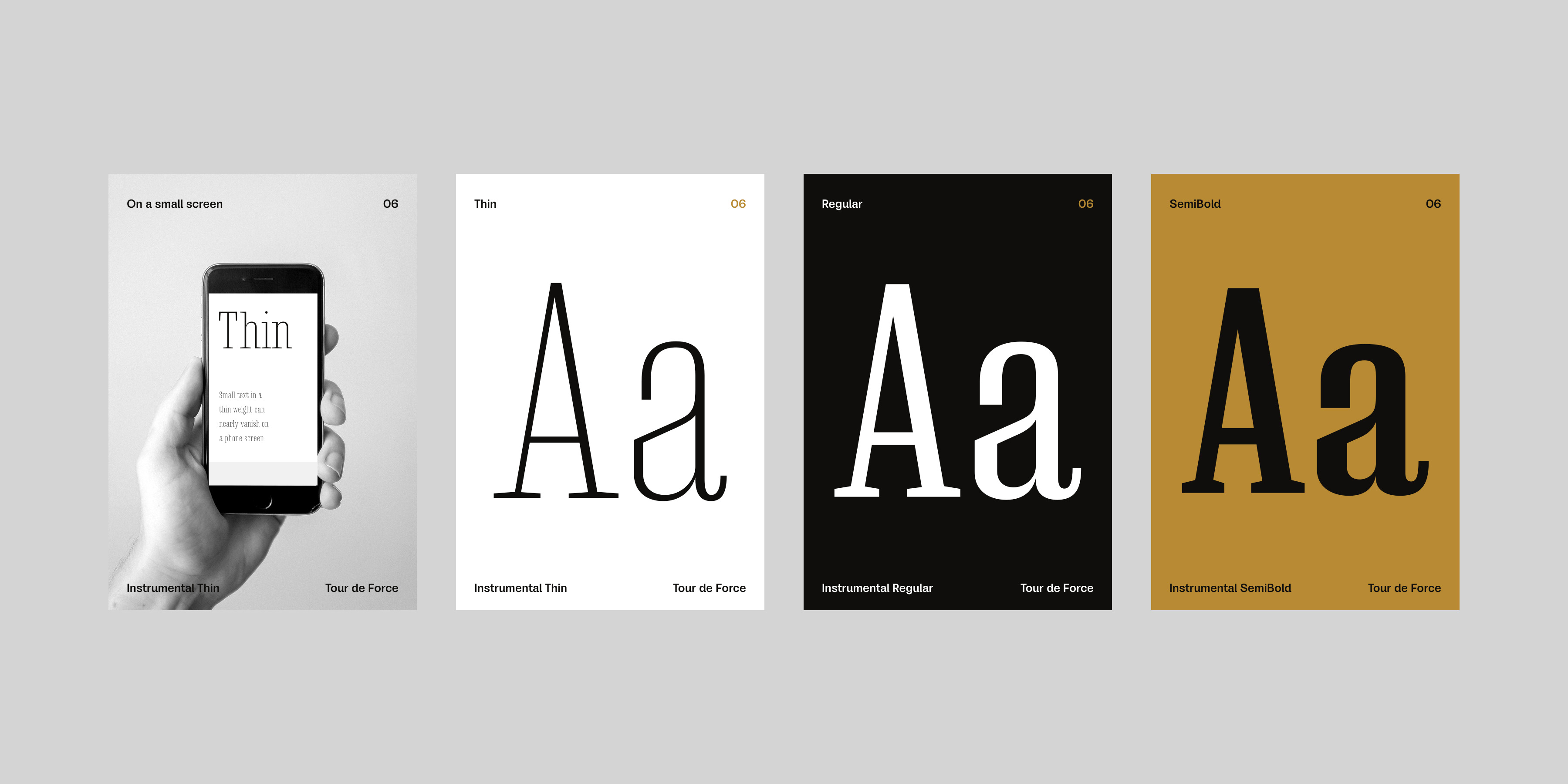
1. Thin letters get lost on a small screen
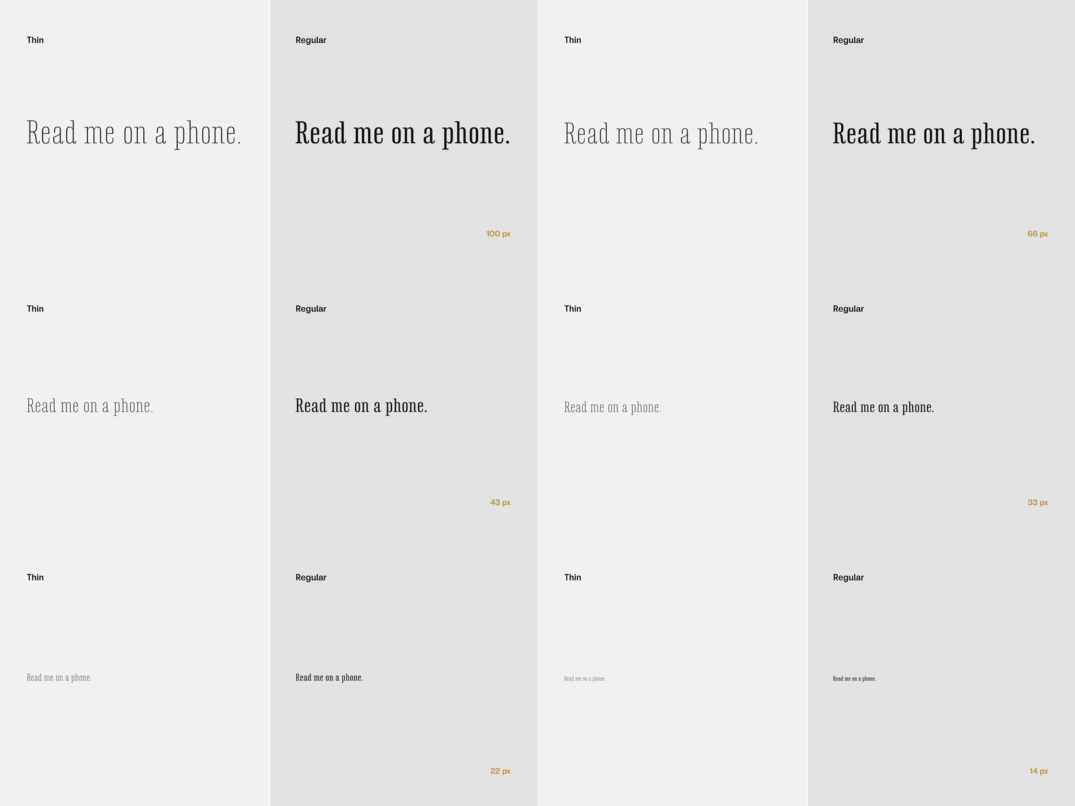
A Thin or Hairline weight looks lovely at large size on a poster. On a phone at body size, the lines can become so thin that they almost disappear. Use light weights for big headlines and a Regular or heavier weight for small text.
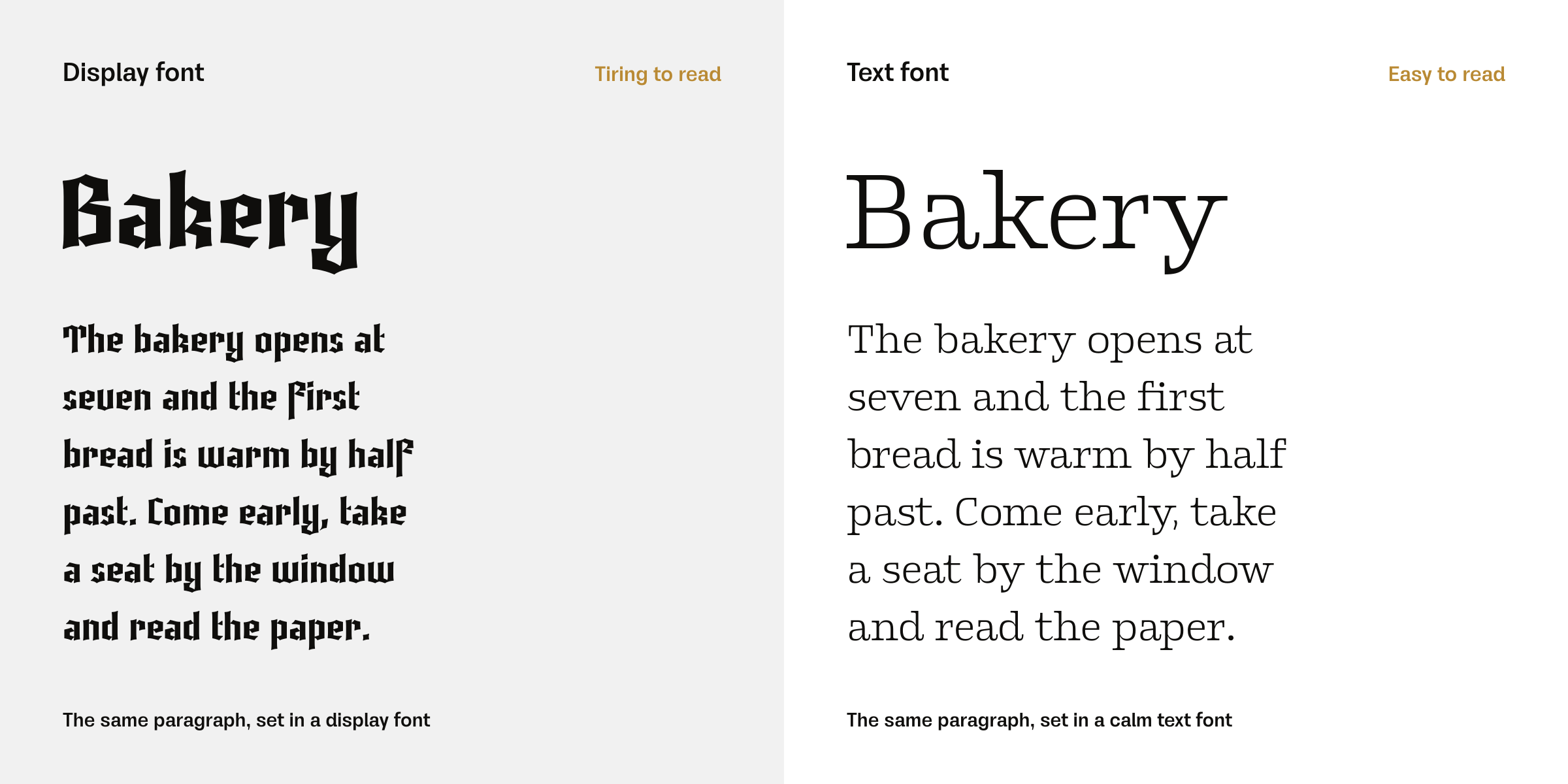
2. Display fonts are not for long text
Fonts with big personality, such as blackletter or layered fonts, are made to be looked at, not read for ten minutes. For a paragraph, use a calm text font and let the display font do just the title.
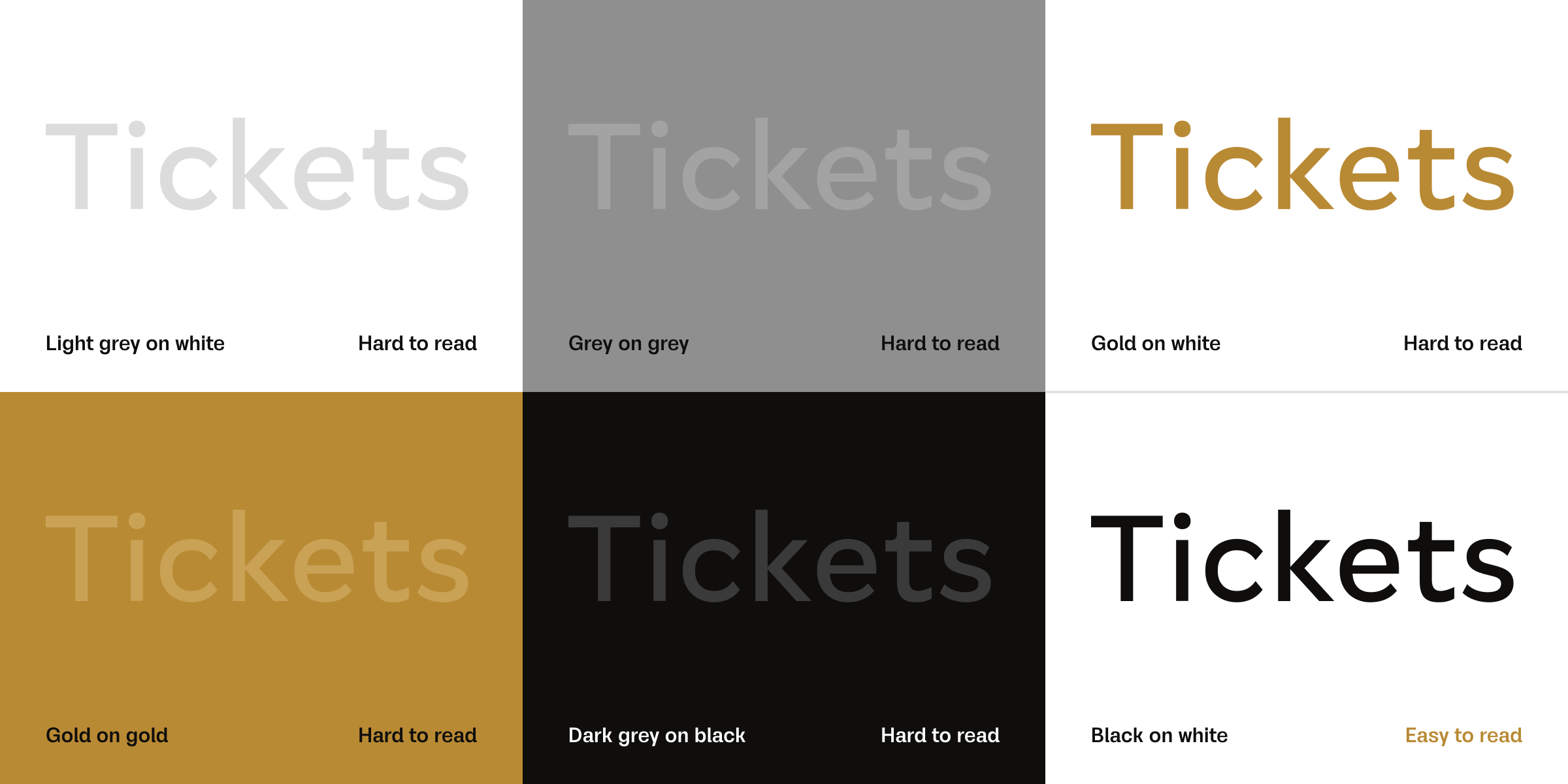
3. A font cannot save a message with too little contrast
Light grey text on white, or gold on white, is hard to read in any font. Check that your text colour is clearly darker or lighter than the background.
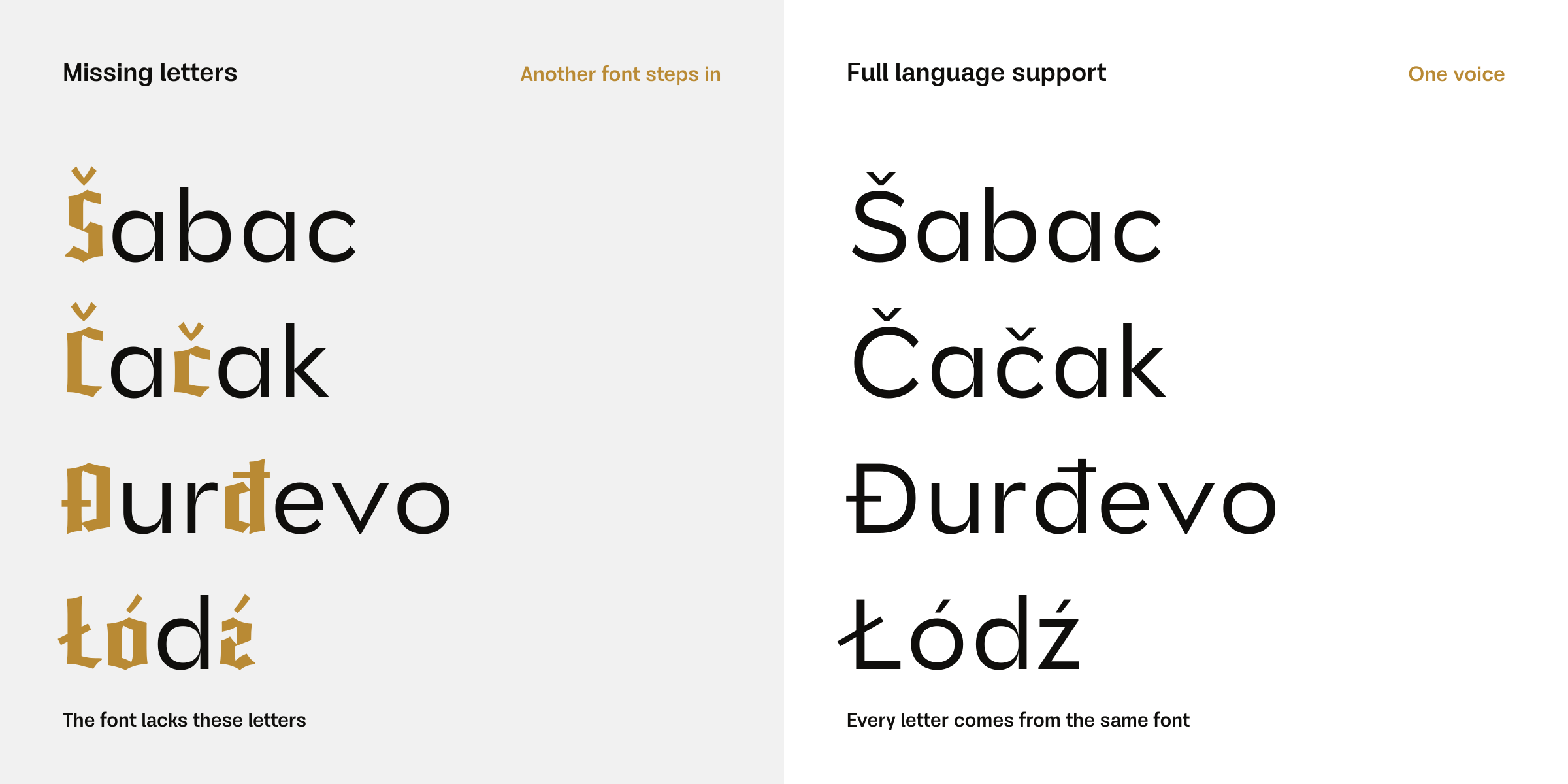
4. Not every font has every letter
If you write in Serbian, Czech, Turkish or Polish, you need letters like č, ć, š, ž, đ, ł or ğ, and a font that lacks them will fall back to another font in the middle of a word. Before you buy, check the language support on the font page.
5. Small text needs air
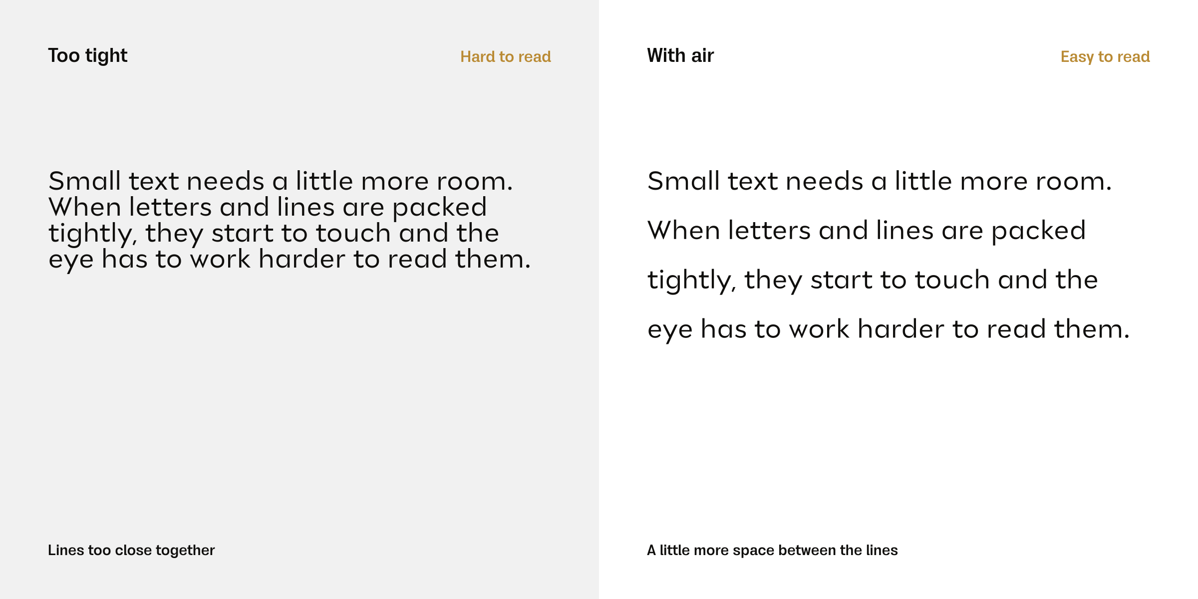
At small sizes, letters that are tightly spaced start to touch. Add a little more space between letters and lines for small text, and use less of it for large headlines.
The simple test
Put your text on the real thing (a phone, a printed page, a packaging box), step back one metre and read it. If you can read it easily, the font is doing its job.
Fonts used in this article