Interview about Deserter font family – Identifont
Dušan Jelesijević01 Aug 2026
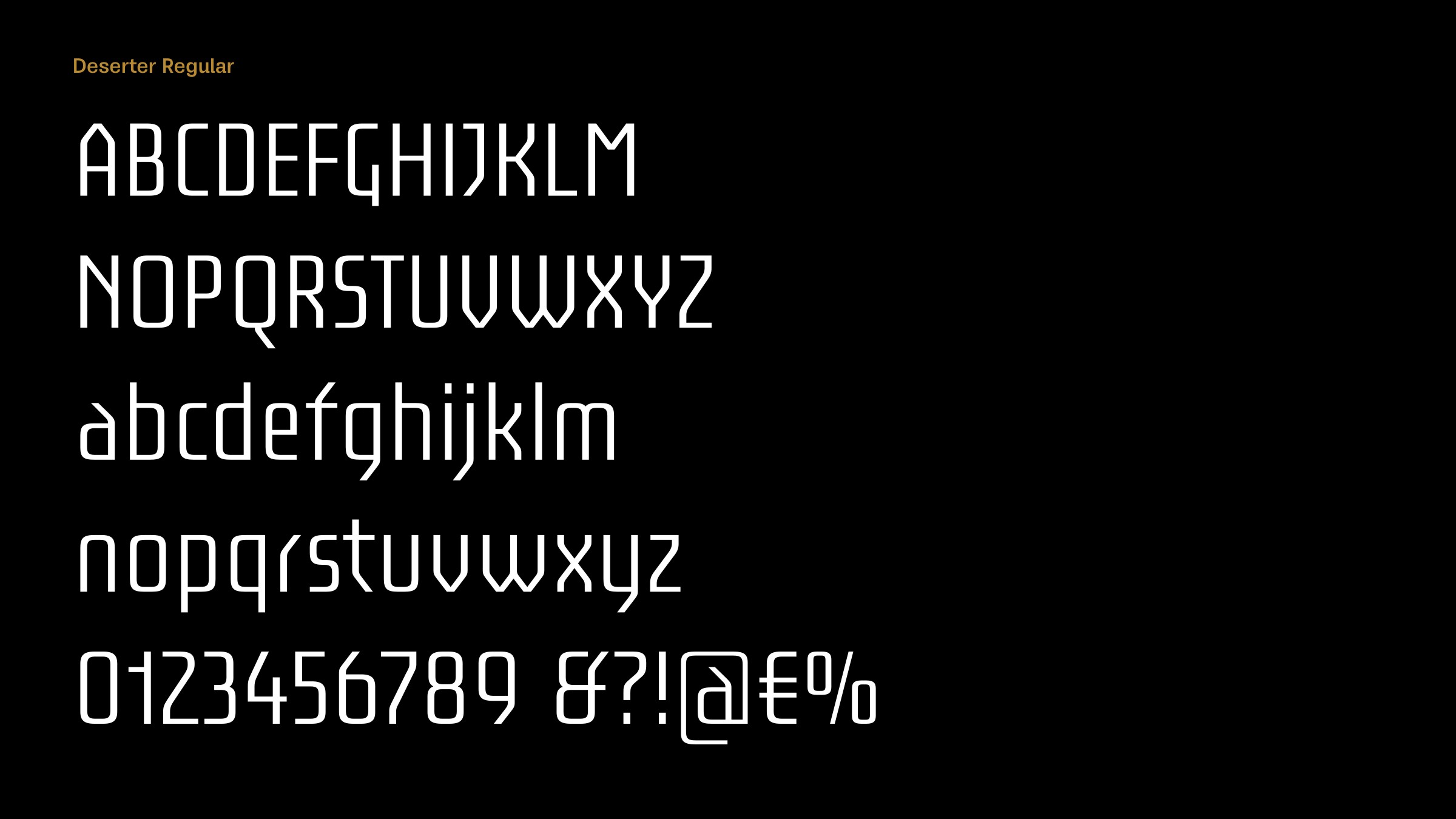
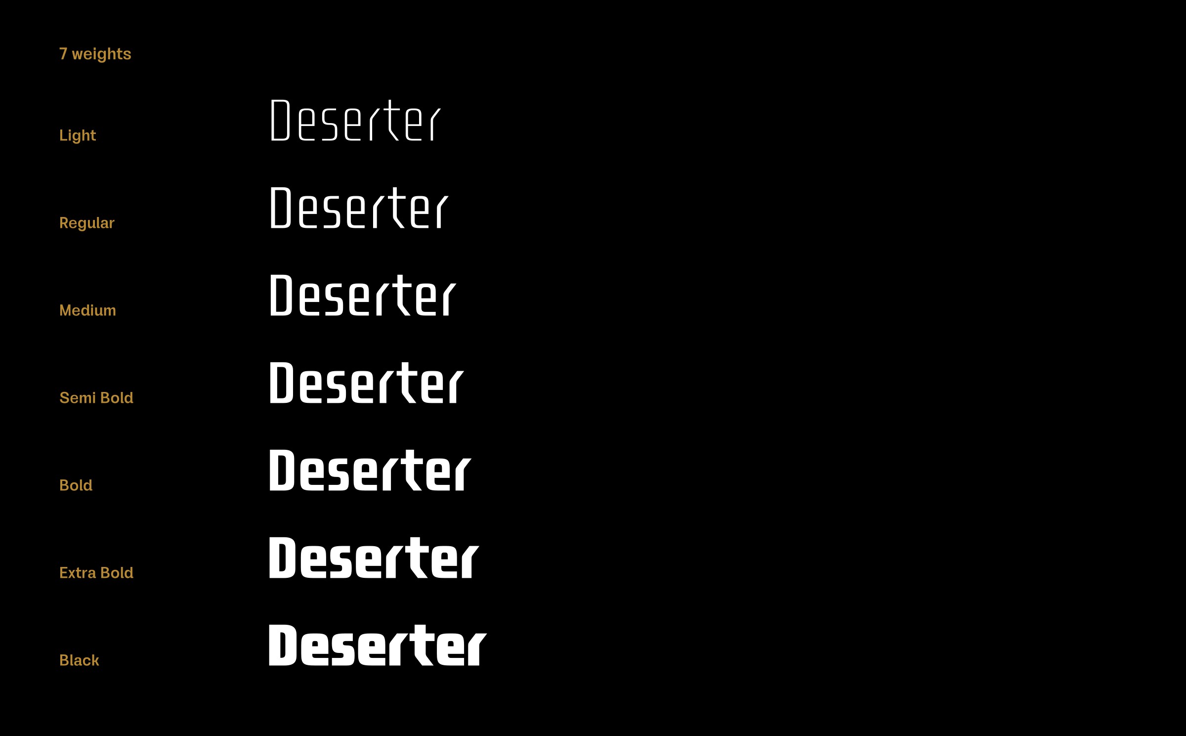
Deserter is a techno-style typeface in seven weights, and with a variable version. What inspired you to design it?
The main idea was to make a monospaced-inspired typeface, but instead of following a monospaced width philosophy, to keep a slight difference in character widths. The aim was to create a font for coding, branding, and everything related to the IT sector and current tech usages.
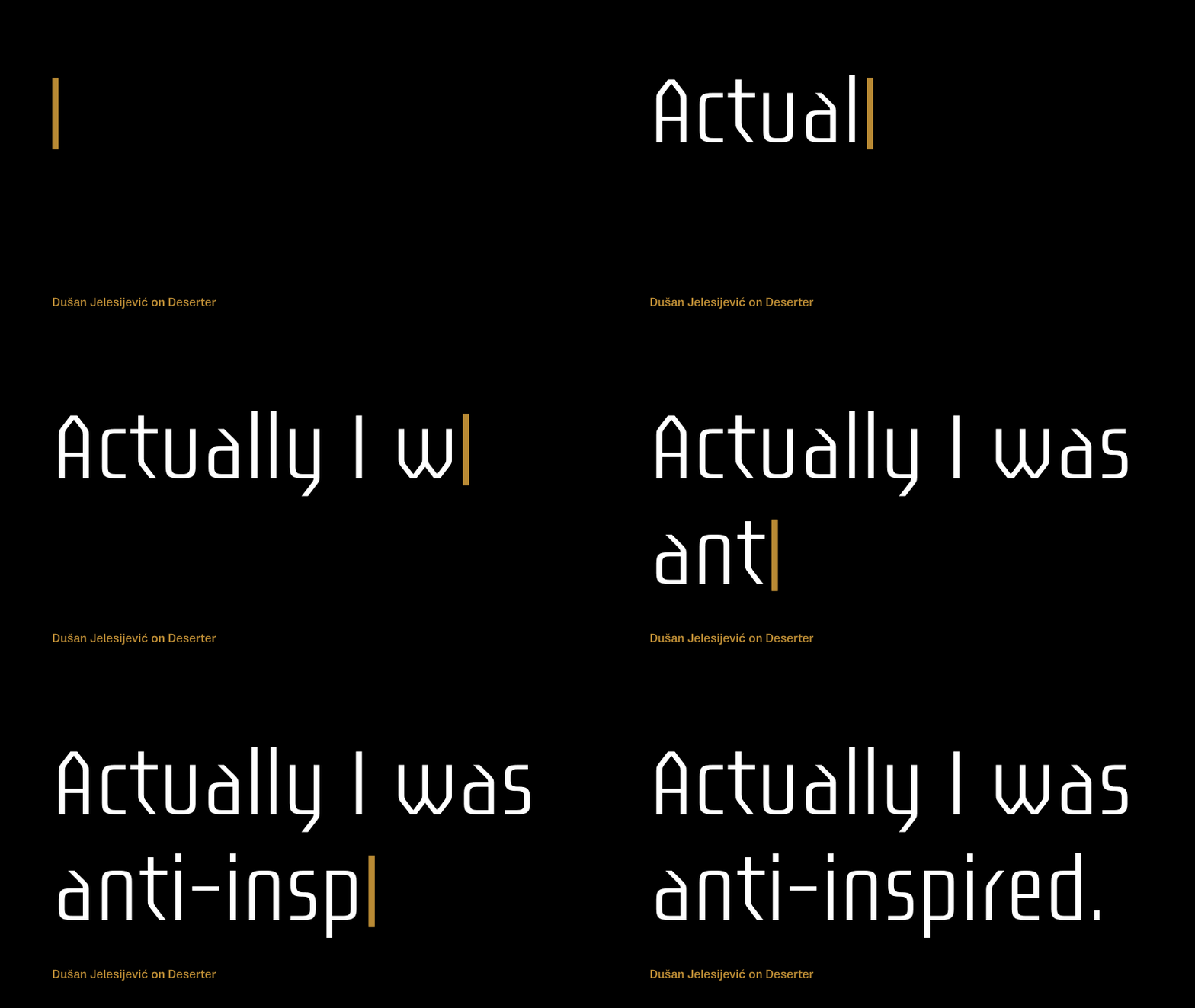
Deserter gets its high-tech look from its use of modular shapes, such as rounded rectangles and angled lines, reminiscent of the machine-readable font OCR-A. Were you inspired by this or any other fonts?
Actually I was anti-inspired. I know those fonts well and I didn’t want to achieve such a look. I wanted something different, but staying in that style category.
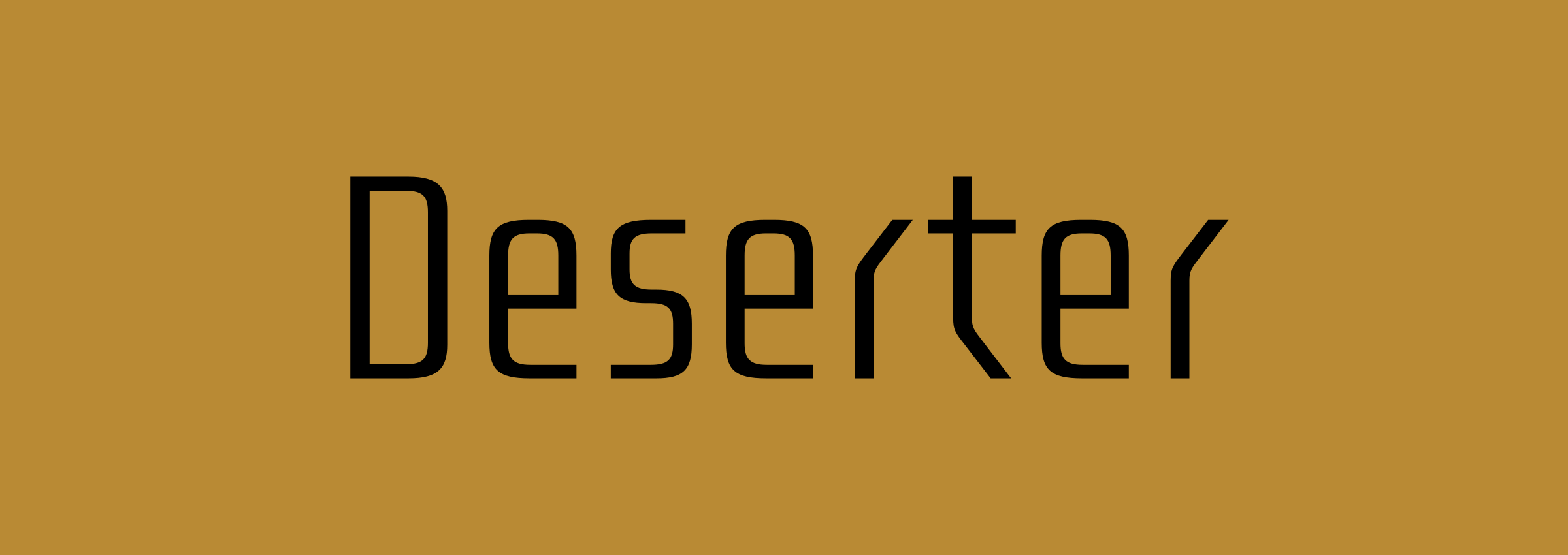
One of the most idiosyncratic characters in Deserter is the ‘r’; it’s perfectly readable in the context of a word, such as the name of the font, but on its own it might be a bit baffling. What gave you the idea for it?
I have some similar character designs in my Ducktail family, mostly in the lowercase letters. In Deserter, they ended up looking more radical, but when they form a word or sentence the font looks pretty interesting. It’s very simple by design, with not much detail, just a straightforward font design for different types of projects; at least in my view.
Deserter looks as if it would work well as a wide font too, like for example Controller Two; have you considered adding a width axis to the variable font?
Honestly, no. For me, it’s the end of the story as far as this design is concerned; I’ve already moved on to another design!
Originally published on the Identifont blog. Questions by David Johnson-Davies, answers by Dušan Jelesijević.
The font
Deserter in the catalogue, with the full specimen, glyph set and licences.