Interview about Dorat font family – Identifont
Dušan Jelesijević29 Dec 2024

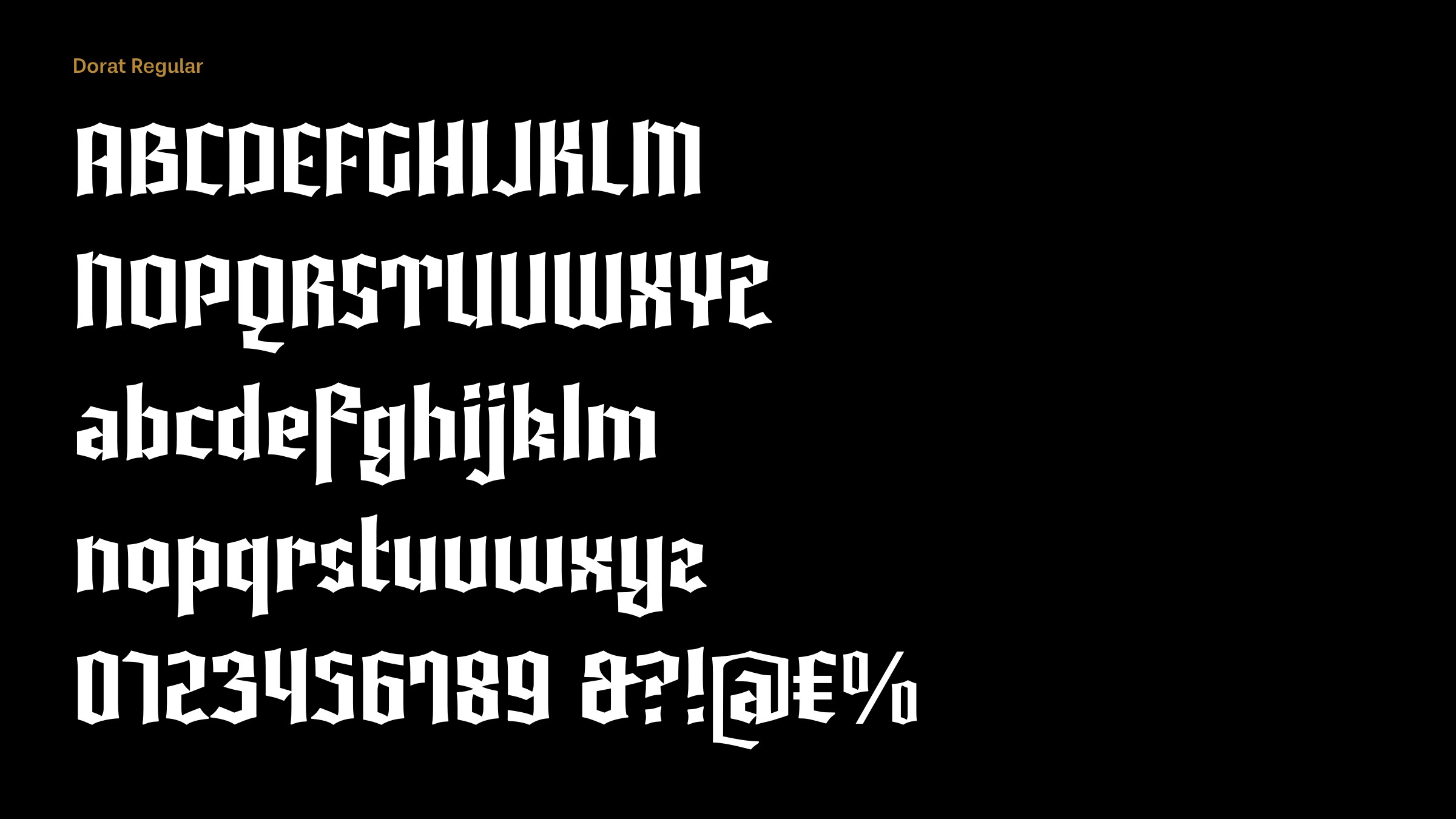
Dorat is a simplified blackletter font with a modern appearance. What gave you the idea of designing it?
Honestly, I wanted to try myself in that category and wanted to try to make something recognisable; not some historical recreation or pure calligraphic style.

The closest classical blackletter I can find to compare with Dorat is Linotype Textur Gotisch. However, you’ve written that you designed it without any reference to classic historical blackletter fonts. Did you just rely on your memory of the blackletter style?
Yes, it was designed without any reference. Like with most of my releases, I just sit and work. I know the order of basic calligraphic moves and steps for each or most of the letters, so I just worked with it as a base.
Contemporary applications for blackletter fonts seem to be limited to historical novels, computer games, beer mats, and certificates. Are these the sorts of applications you had in mind?
My intention was to offer a modern version of a blackletter font to those designers who know how and in what projects to break the chains with the font. I would like to see this font used, for example, on women’s perfume packaging, or as the logo for an IT company. People (companies, designers, and final users) are used to following current trends and it’s hard to find a brave client who’s willing to be different with this or any other uncommon font for their market.
Originally published on the Identifont blog. Questions by David Johnson-Davies, answers by Dušan Jelesijević.
The font
Dorat in the catalogue, with the full specimen, glyph set and licences.