Interview about Fabular font family – Identifont
Dušan Jelesijević01 Dec 2021
Fabular has the look of classic fonts from the late 1800s and early 1900s. Is it a revival, or an original design in that style?
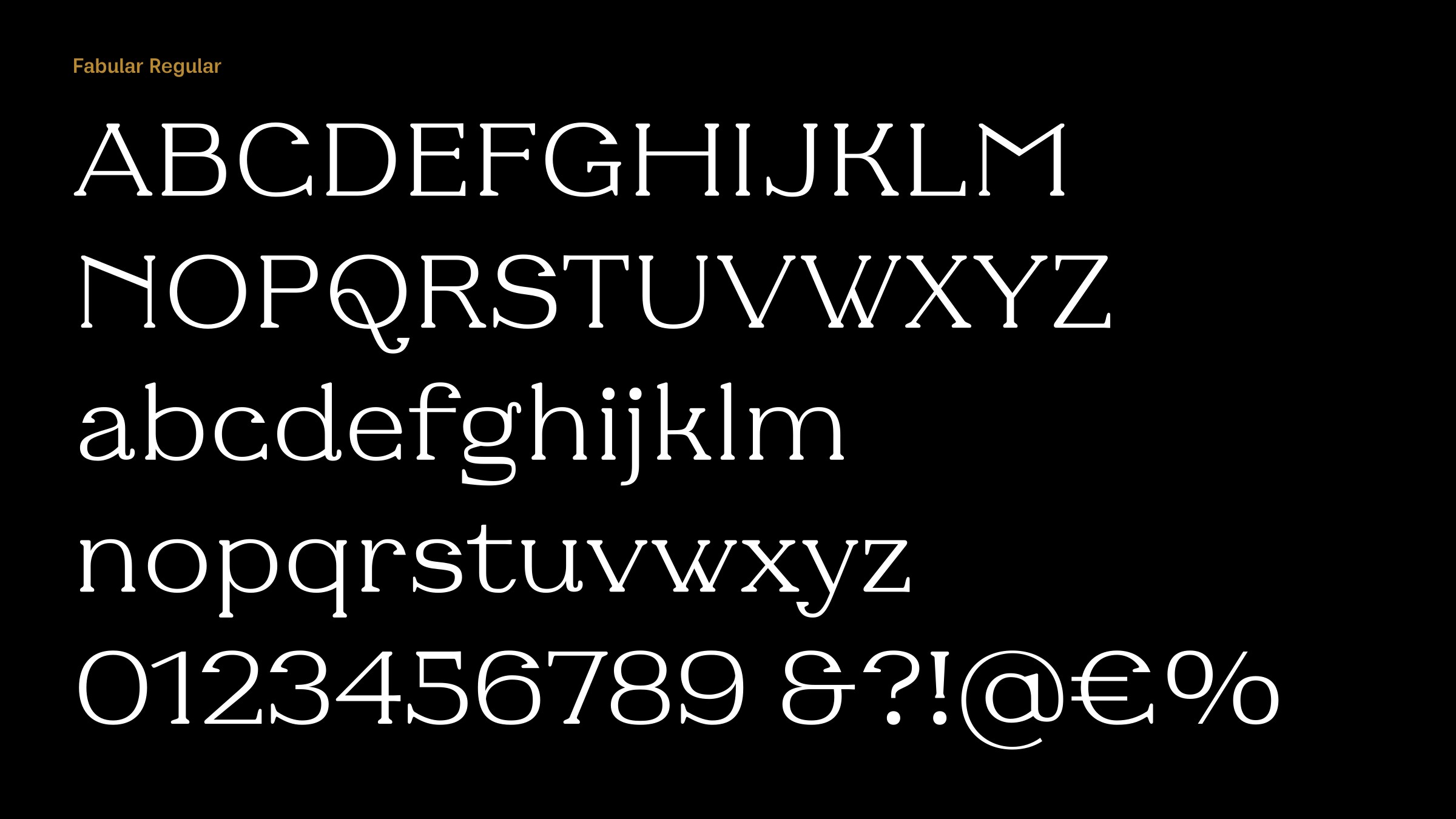
Fabular is a revolt against a trend that was popular on MyFonts a while ago. As it goes, once someone releases a font family that becomes a top seller we soon have tons of copy-paste similar typefaces, in the same style. I’m talking about display serif fonts inspired from the 70s and 80s, with gentle, curvy terminals and fat serifs. Fabular was my reaction to that trend – it’s an original but slightly strange family with serifs in unexpected places and stems that aren’t high contrast.
Its design does incorporate some of the typographic elements from the period you mentioned, but there was no direct inspiration for Fabular. I just created it having in mind the trend I wanted to avoid, playing with serifs and letter shapes.

The closest I can find to compare Fabular to on Identifont are the revivals Bellwether Antique NF and Federlyn NF by Nick Curtis. Were these or any other period fonts influences on your design?
I look for inspiration in vintage typefaces, mostly in books from my collection. There are a couple of books that really turn me on with ideas, like Taschen’s “Type – A Visual History of Typefaces and Graphic Styles” or “Euro Deco: Graphic Design Between the Wars” by Steven Heller and Louise Fili. I've never done a revival, as it requires a decent set of samples, documentation, and time which is not just straight designer’s work, but I like to analyse vintage typefaces, looking for details and different solutions that could be updated.
As a designer, whatever genre I'm working in even if it’s geometric sans, I want to easily identify my font when I see it in use, and not have it confused with other fonts. I think that’s the main quest of a creative designer, not just to reproduce, but to be able to bring something fresh and distinctive to customers.
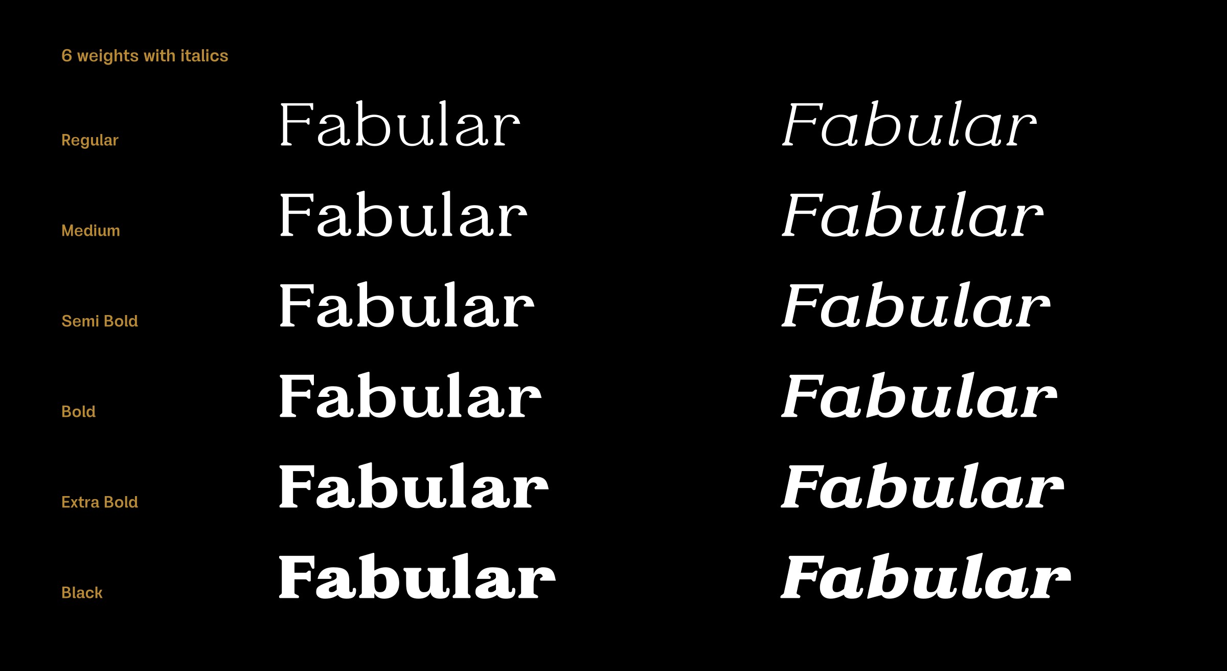
Most period fonts were only designed in one weight, or at most two, but with Fabular you’ve provided a generous range of six weights, and italics. Were there any particular issues with extending the design to such a wide range of weights?
Yes, there were some problems with the darker weights, especially with letters that ended with a serif. Letters such as ‘a’, ‘c’, ‘s’, and ‘r’ were initially too dark because the serif was enclosed in the letter shape. I solved it by visually adjusting them to give the same tone and harmony as the other characters. An interesting aspect of the italics was that I didn’t want to condense the characters in the manner of usual italics, because I thought Fabular should retain its display personality and still be clearly recognisable in the italics.
Originally published on the Identifont blog. Questions by David Johnson-Davies, answers by Dušan Jelesijević.
The font
Fabular in the catalogue, with the full specimen, glyph set and licences.