Interview about Locker Room font family – Identifont
Dušan Jelesijević01 Sept 2023

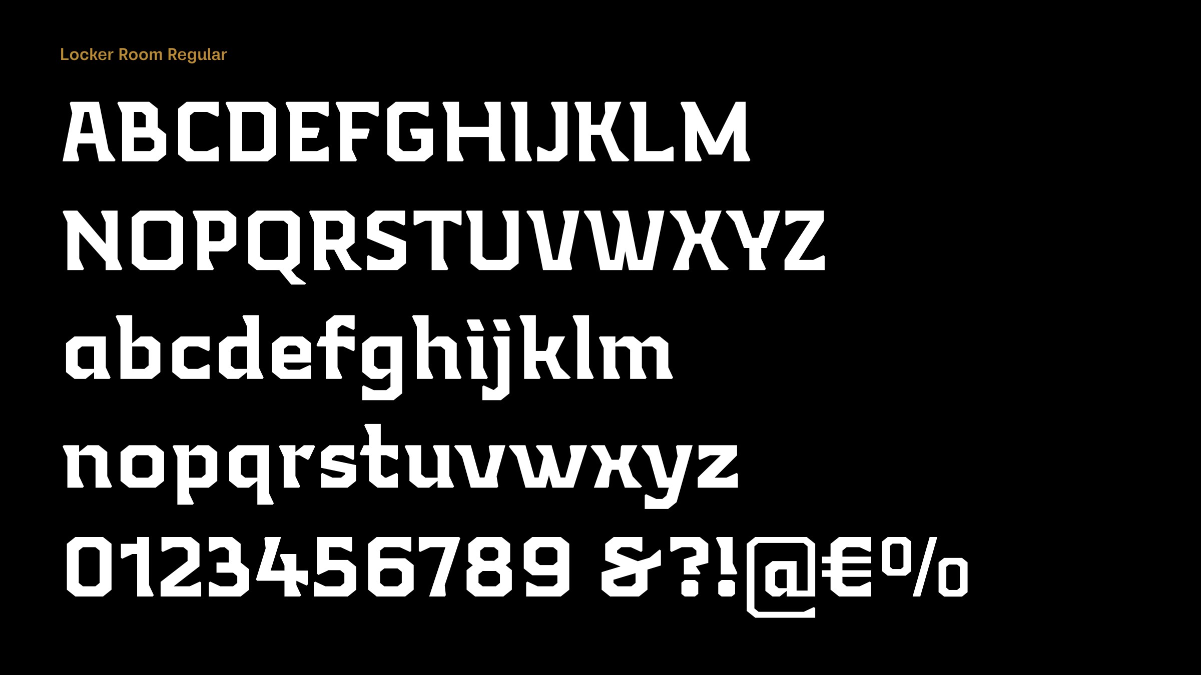
Locker Room is a typeface constructed entirely from straight line segments. What gave you the idea of designing it?
Locker Room is an old design from 2019 when I primary worked with FontLab Studio 5. The idea came from watching basketball and football games and seeing different fonts used for players’ names and numbers on jerseys. but I abandoned it because it was not looking promising to me. From time to time I browse those old designs and see if there's anything interesting to be worked on, and Locker Room is one I revived this year.

Straight-line fonts have traditionally been popular for use on sportswear, perhaps because they are easy to screenprint or cut out and iron on; a classic example is ITC Machine. Did you have sportswear in mind when you designed Locker Room?
That's exactly what I had on my mind. It provoked me to think about the idea of creating a font for the same purposes: sportswear for professional clubs or universities and their sports activities. It might also be suitable for craft beer manufacturers, bars, restaurants, or similar business activities where owners are looking for a typographical style of branding with a vintage look.
Locker Room is more dynamic than typical straight-line fonts because of the triangular serifs, which point in opposite directions at the ends of vertical strokes. What inspired this aspect of the design?
That's true. It's not a typical typeface from this category, and those serifs are one of details that make it unusual. I think they give a visual dynamic to words composed with Locker Room, while on the other hand it takes more spacing between letters. The inspiration for the serifs came from semi-serif typefaces, such as Rotis Semi Serif, Areplos Text, and Ninfa; I love the asymmetry they give.
Originally published on the Identifont blog. Questions by David Johnson-Davies, answers by Dušan Jelesijević.
The font
Locker Room in the catalogue, with the full specimen, glyph set and licences.