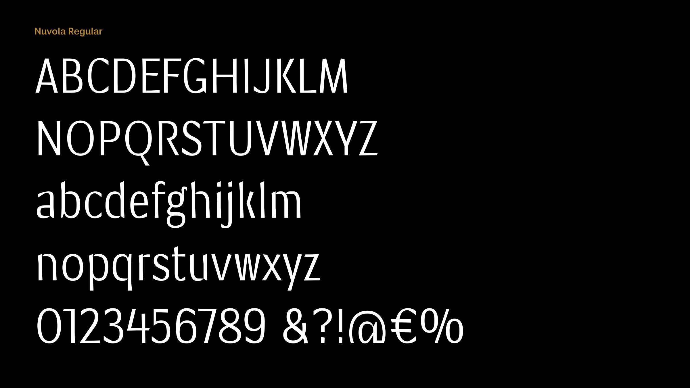
Interview about Nuvola font family – Identifont
Dušan Jelesijević01 Apr 2025
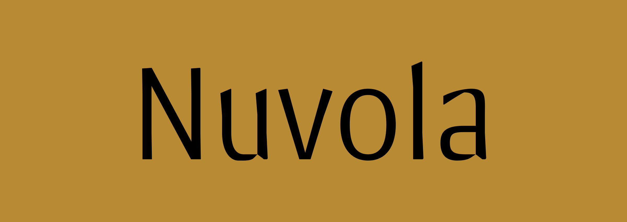
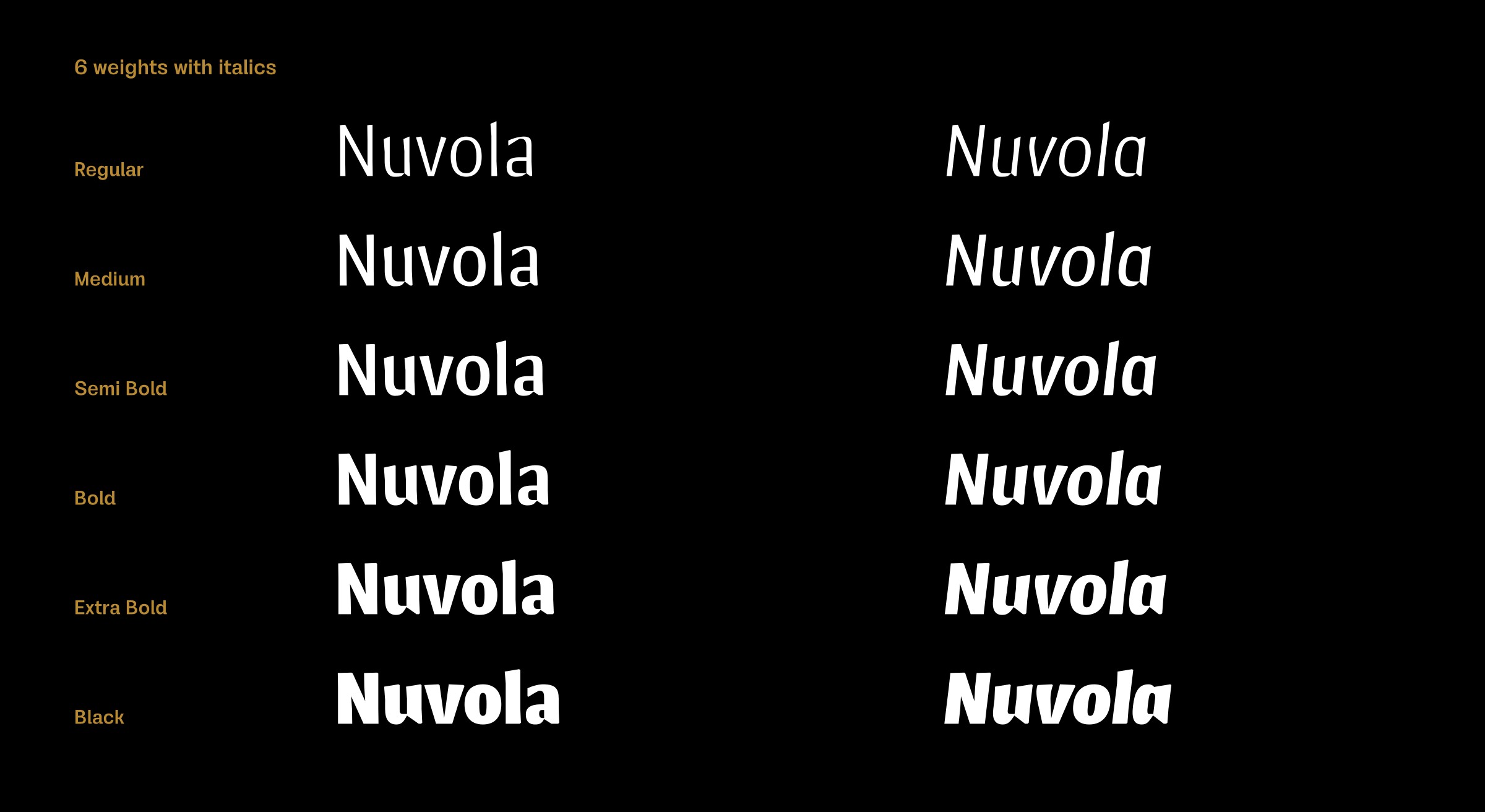
Nuvola is a sans-serif typeface in six weights with italics. What inspired you to design it?
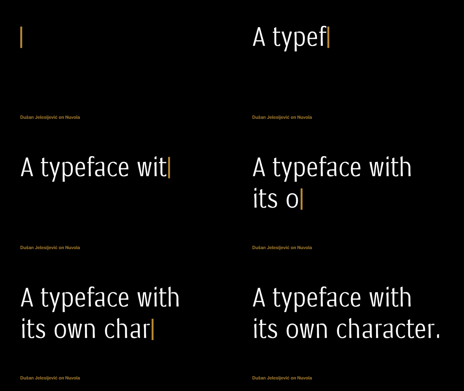
I wanted to create a contrasted sans-serif typeface. At first I had Optima in mind, but pretty soon the design process took me in another direction. To my eyes, Nuvola is a compact typeface with a decent dose of details; a typeface with its own character.
Many of the strokes are more calligraphic than geometric, giving Nuvola a hand-drawn look. Did you draft some of the characters with ink on paper to achieve this?
Yes, I sketched a couple of letters with pen on paper, but not with ink and nib or brush as I’m not so good at calligraphy. Actually, I can’t remember when I did classical calligraphy. What’s interesting is that if I compare early sketches with the final typefaces, they usually differ a lot. But sketching helps to generate ideas, and provokes and pushes you to take further steps in the design process.
In many of the lower-case characters the curved strokes are tapered where they meet the stem, which gives the illusion of a gap, almost like a stencil font; examples are the ‘a’, ‘b’, ‘d’, ‘h’, ‘m’, ’n’, ‘p’, and ‘q’. What was the thinking behind this?
I was aiming to add some dynamics and contrast into the letter designs by minimising the join between stems in those letters. And that rhythm was applied across the whole typeface.
Did you have any particular applications in mind when you designed Nuvola?
Well, nothing specific; I just wanted it to be suitable for any situation where a classical geometric sans-serif could be used. I’m aware that this type of sans-serif font is less popular than geometric sans serifs, but I try to avoid being influenced by market trends.
Originally published on the Identifont blog. Questions by David Johnson-Davies, answers by Dušan Jelesijević.
The font
Nuvola in the catalogue, with the full specimen, glyph set and licences.