Interview about Operandi font family – Identifont
Dušan Jelesijević01 Jun 2023
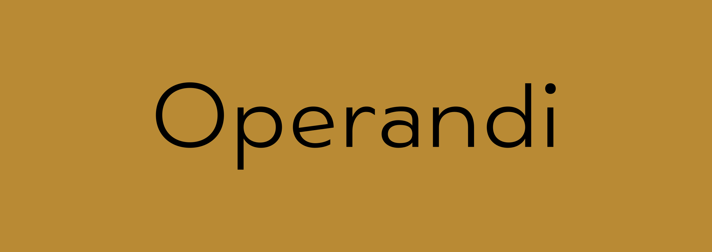
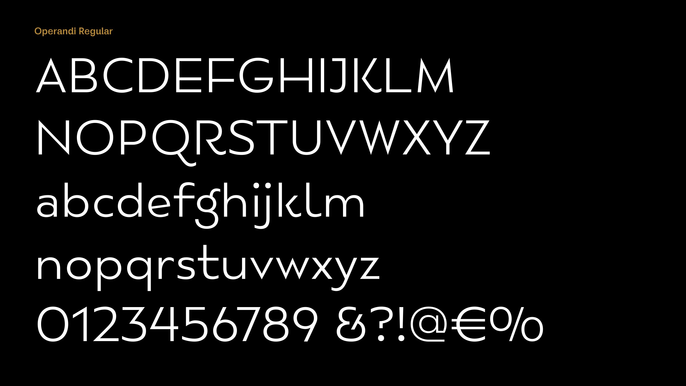
Operandi is a sans-serif typeface with a 1920s look to it. What was it inspired by?
I was watching the 2022 Elvis movie with Tom Hanks and Austin Butler, and there were many scenes featuring different titles on stores, windows, pastry shops, and neon lights etc, and I liked that feeling of vintage typography and how it was blended into a movie from 2022. So, it provoked me to create a sans-serif family with elements of retro design.
Some of the character shapes in Operandi are reminiscent of Bernhard Gothic and ITC Bauhaus, both typefaces from the 1920s. Were these influences on its design?
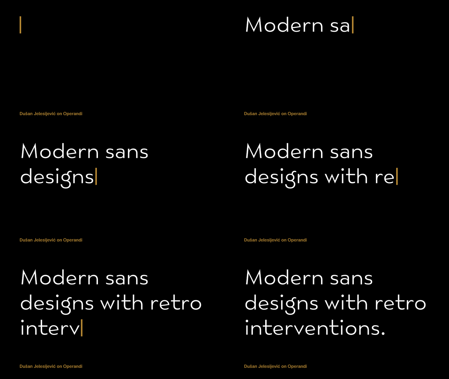
Not directly. I analysed Bernhard Gothic a bit some time ago, and a couple of others like P22 Art Deco Chic and Mostra One, before working on Operandi. I'd say Operandi is more based on modern sans designs with retro interventions, just like the Elvis movie I mentioned – you can see it's modern even it tends to give the impression of another period. If I had to classify it, it would be under art deco sans-serif families.
When you’re designing a new typeface do you find that one or two characters take a disproportionate amount of time? For example, it always seems to me that the ‘Q’ has the most room for creativity.
I guess it depends more on the design style of the typeface. ‘Q’, ‘f’, ‘t’, ‘K’, and ‘R’ are probably the ones that gives you a bit more freedom in design. But it also depends on the typeface weight. Some thicker weights can give you an extra opportunity to make something characteristic. On the other hand, in last couple of years there's a trend among new designers to publish typefaces that are on the edge of readability in order to offer originality. Almost every letter in that kind of typeface looks like it's overdesigned for my taste. My challenge is to offer a distinctive enough typeface while keeping some traditional values in the design of its letters.
Originally published on the Identifont blog. Questions by David Johnson-Davies, answers by Dušan Jelesijević.
The font
Operandi in the catalogue, with the full specimen, glyph set and licences.