Interview about Poruka font family – Identifont
Dušan Jelesijević01 Mar 2022
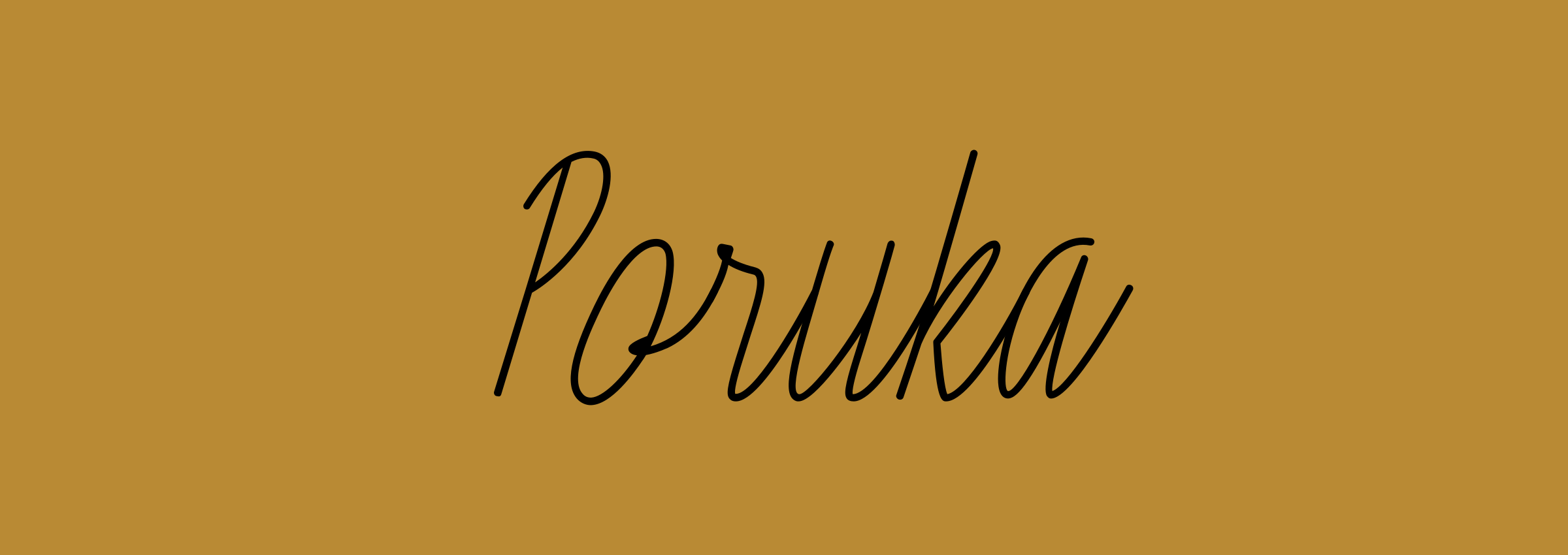
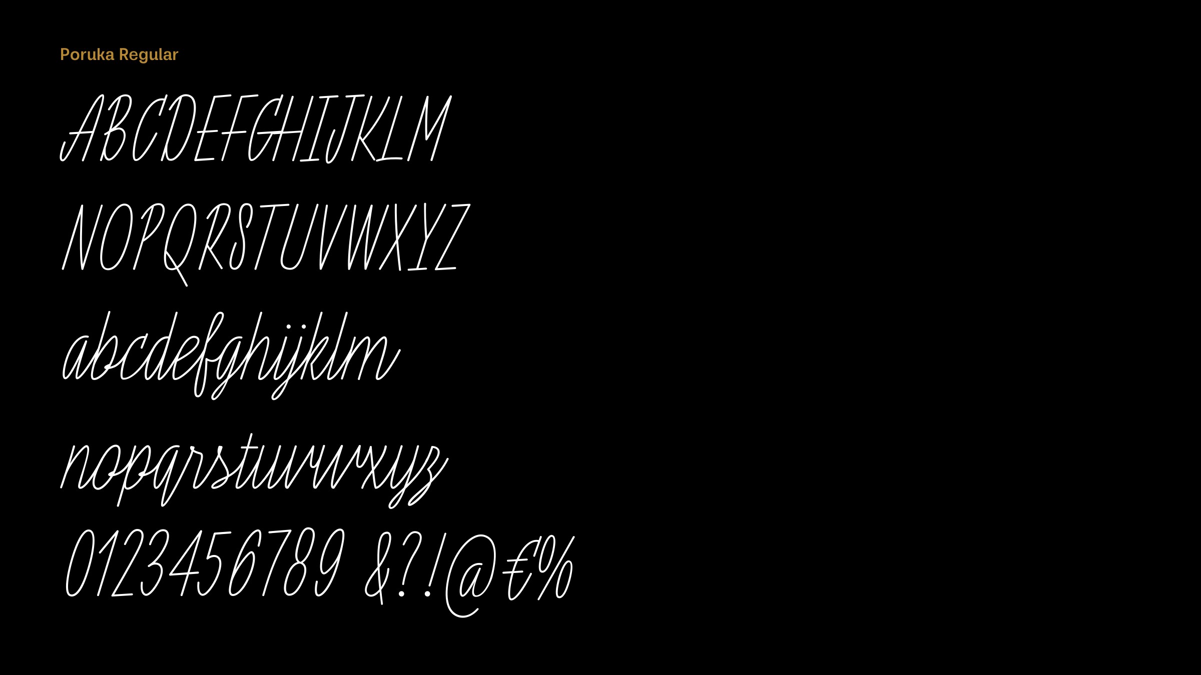
Poruka is an unusually tall cursive handwriting font, with a monoline stroke. What led you to design it?
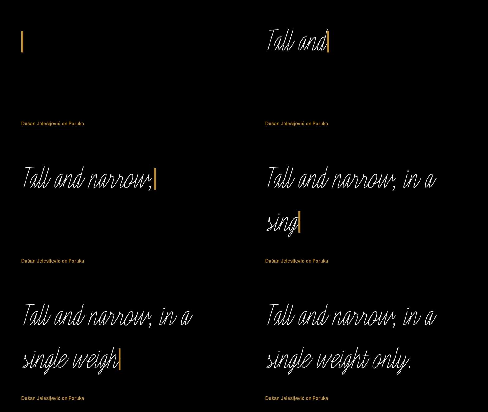
Sometimes I look at our font catalogue and think about what should be our next release. So, I thought about one simple script that could either be used as the primary font, or paired with some contrasted font. It would be tall and narrow, in a single weight only, and monoline which gives the ability to make some design parts smoother. For example, if I want to make letters for the swash OpenType feature, it gives more space for experimenting with the design of loops.
Is it based on your handwriting, or was it inspired by other fonts?
My handwriting is very ugly, not even close to Poruka. It’s been captured in the Dusan Script family which I designed back in 2009 for Ascender Corp. Poruka was inspired by the same category of script fonts, but I’d say visually less sweet and more constructed than similar fonts. Letters like ‘a’, ‘b’, ‘d’, ‘g’, ‘p’, and ‘q’ have very similar bowls, so it differs from common script font philosophy. At smaller sizes Poruka looks a bit strict, like some technical letters, but it still contains a dose of freely driven lines, enough to make a fine balance and rhythm among letters.
How do you go about designing a font like this? Did you sketch the characters on paper, or was it designed on-screen?
I used to design fonts directly on-screen, but as time goes by I use paper more and more. It's probably because I started making drawings and illustrations on paper, so it led to me drawing letters as well. With Poruka I initially sketched a few letters, and then traced them to see what happened.
Poruka looks ideal for greetings cards and restaurant menus; are those the sorts of applications you had in mind?
Yes, greetings cards, restaurant menus, wedding invitations, slogans, product descriptions, or maybe a book of modern poetry. It includes swashes, two stylistic sets, and discretionary ligatures that are a few predesigned words, such as "yes", packed in cool shapes. I had a lot of fun designing them!
Originally published on the Identifont blog. Questions by David Johnson-Davies, answers by Dušan Jelesijević.
The font
Poruka in the catalogue, with the full specimen, glyph set and licences.