Interview about Satiata font family – Identifont
Dušan Jelesijević01 Jul 2022
Where did the idea for Satiata originate?
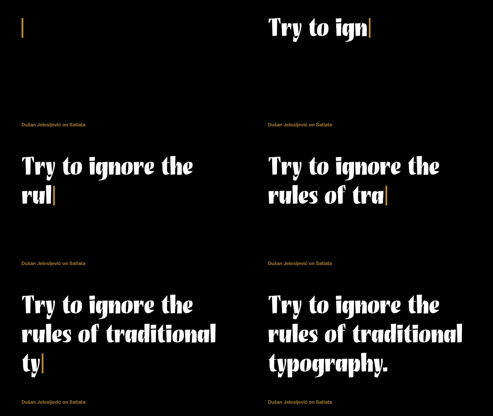
The idea came during a pause between releasing bigger families. From time to time I have a small break from designing constructed fonts, and I do some relaxing work without the pressure of making a commercial release – projects where you can play and try to ignore the rules of traditional typography and fonts. So, Satiata is result of that game.
Satiata is a striking headline font that looks like it was drawn with a brush or pen. Did the design start from paper sketches?
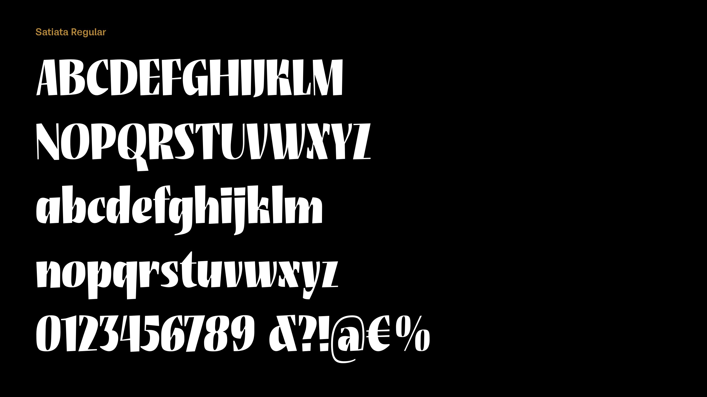
It started as an old sketch drawn in FontLab. I have dozen of folders with ideas I’ve started, usually with only a few letters. I found some old sketches of a freehand sans design in a heavy weight and started playing with it, adding serifs and ink traps, changing the weight of the stems, making it darker, and making the whole design slightly condensed. It turned out to be an interesting set of letters that worked pretty decently for words and sentences.
As you said, it is purely a headline font that could find applications in package design, posters, or book covers. I would be very happy to see it in use one day, even though I’m aware that Satiata probably won’t gain much popularity or publicity.
It’s a sign of Satiata’s originality that I’m finding it hard to find any other similar fonts to compare with it; the closest I can find are Michael Harvey’s Mezz Black and Roger Excoffon’s ITC Banco Heavy. Were there any particular fonts you were influenced by?
There were not any specific influences. Maybe I saw something unconsciously and turned it into Satiata, but not that I’m aware of. It’s probably one of my most recognizable fonts by design so far. I’d say that’s one of the good things, when you can recognize your fonts among others.
Currently Satiata is in a single style. Have you had any thoughts about creating other widths or weights?
I guess not, because the plan was to release a display font as a single style only. When I release a font I consider it’s over, and it’s hard to get back to it. Some time usually has to pass before I am able to think about it and work on it again. So, who knows, maybe one day.
Originally published on the Identifont blog. Questions by David Johnson-Davies, answers by Dušan Jelesijević.
The font
Satiata in the catalogue, with the full specimen, glyph set and licences.