Interview about Stropha font family – Identifont
Dušan Jelesijević01 Apr 2021
How did Stropha begin? Did you set out to design it for a particular project or application?
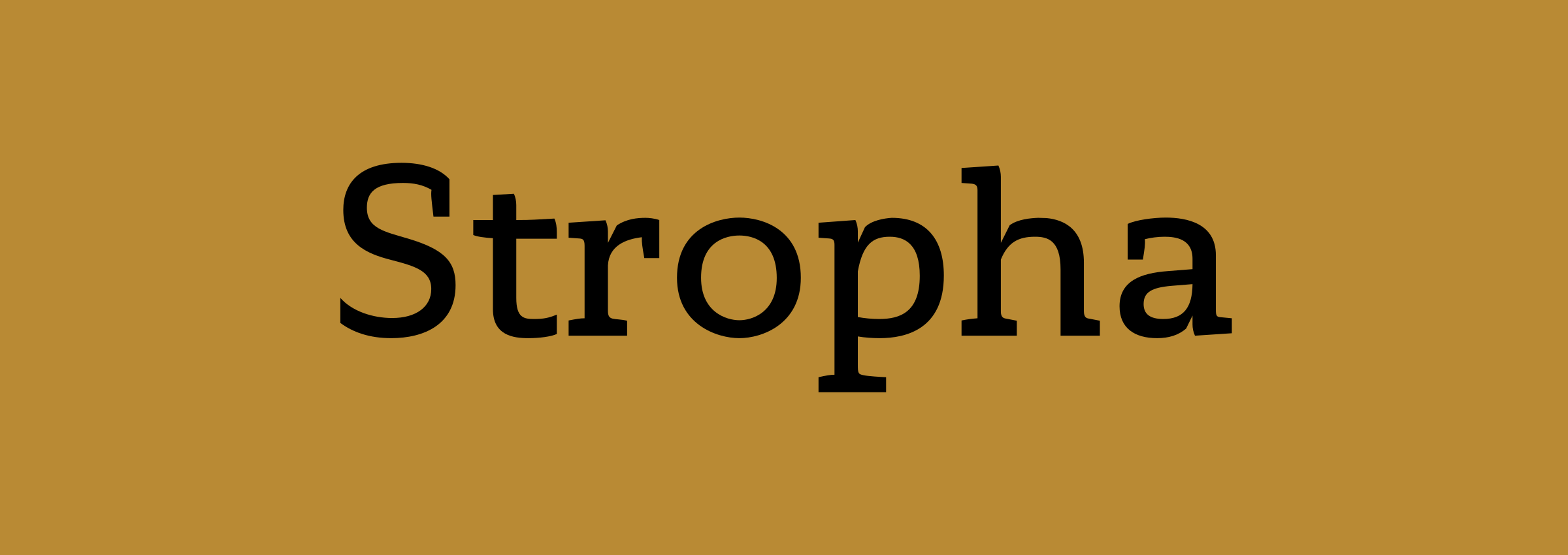
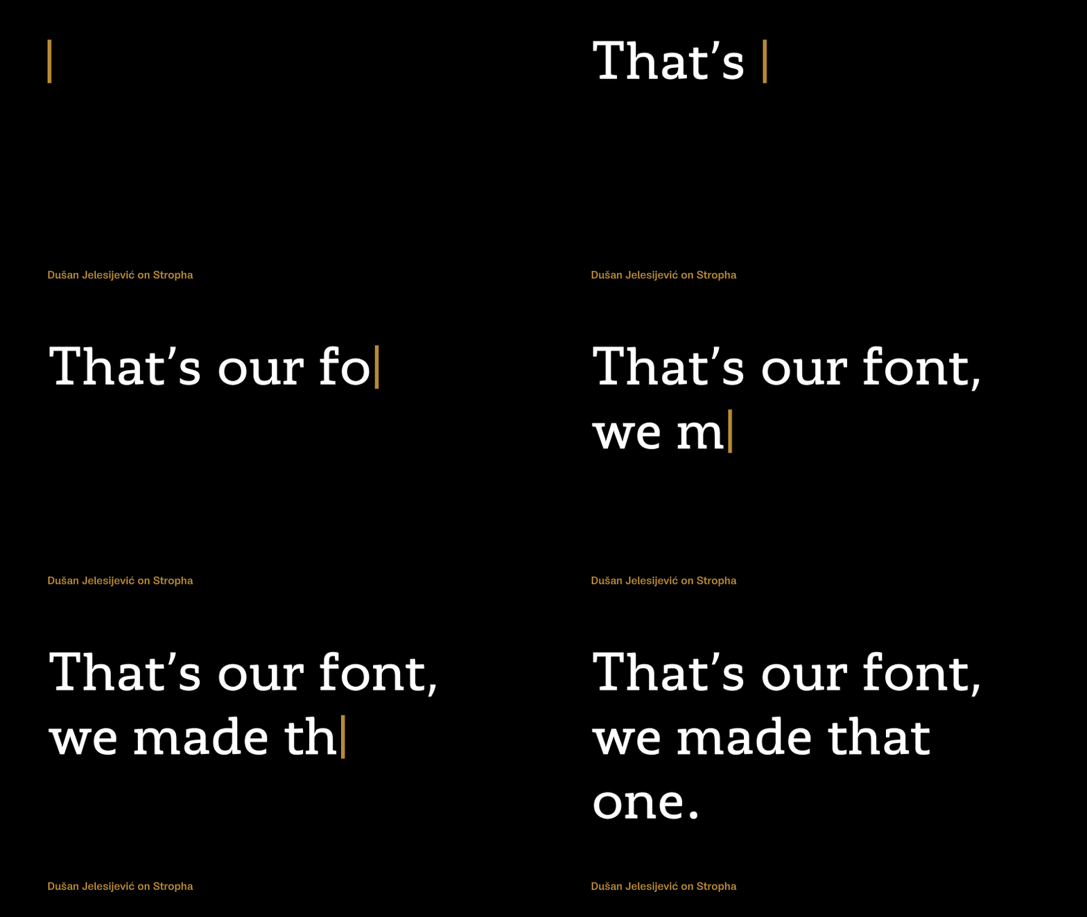
I wanted to have a recognisable and original slab-serif family in our catalogue; one that, when I see it in use, I can say at once: “That’s our font, we made that one.” No matter how much commercial success it may achieve, we want to make fonts that are distinctive and the product of our own design perception. Otherwise it would be pointless to invest time in making a copy of a copy just because the original of the copy of the copy hangs high on selling lists.
Are there any other typefaces that you studied or influences you had in the development of Stropha?
To be honest, I can’t remember any; it’s been two and a half years since it was designed and I’m getting old :-)
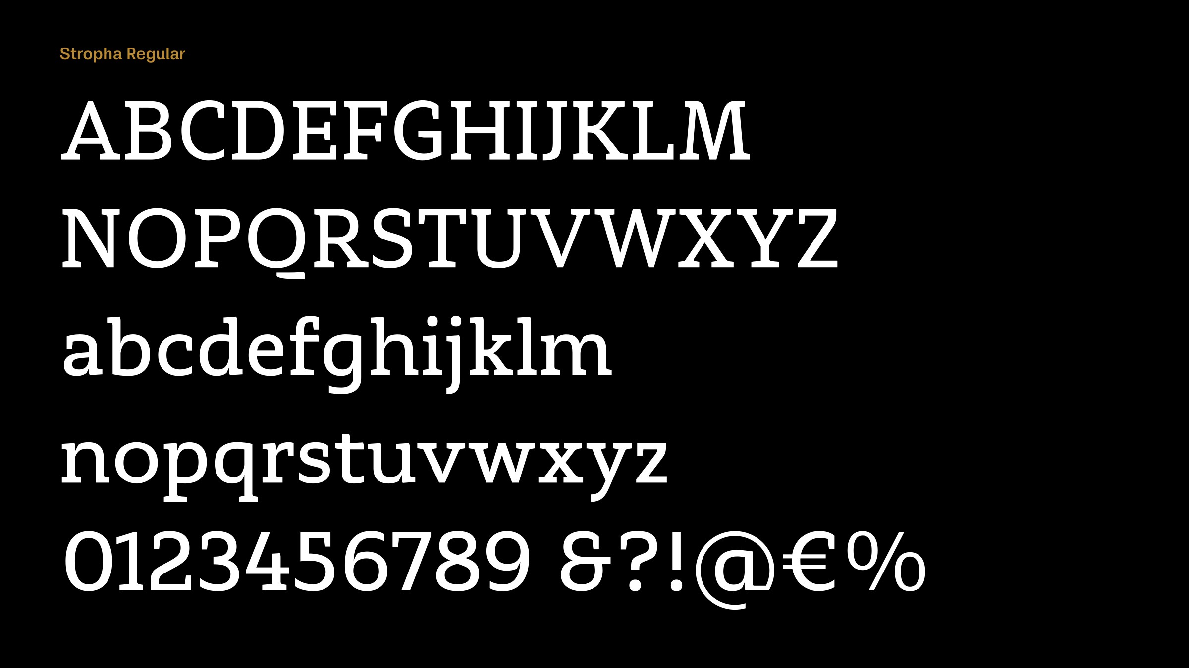
At first glance Stropha looks like a classic geometric slab-serif, like Serifa, but Stropha has humanist features, like the curved junctions on the ‘M’ and ’N’, and drop-shaped counters on the ‘b’, ‘d’, ‘g’, ‘p’, and ‘q’. Was that a design aim from the outset?
You’re right. Classical geometric shapes were softened with different kinds of details. Besides the characteristics you mentioned, Stropha contains asymmetric serifs and a gentle difference between horizontal and vertical stems. The drop-shaped counters visually open the characters more, and I think they are also worthy for the overall contrast of the letters. There are also curved crossbars on ‘f’ and ‘t’, which I personally like.
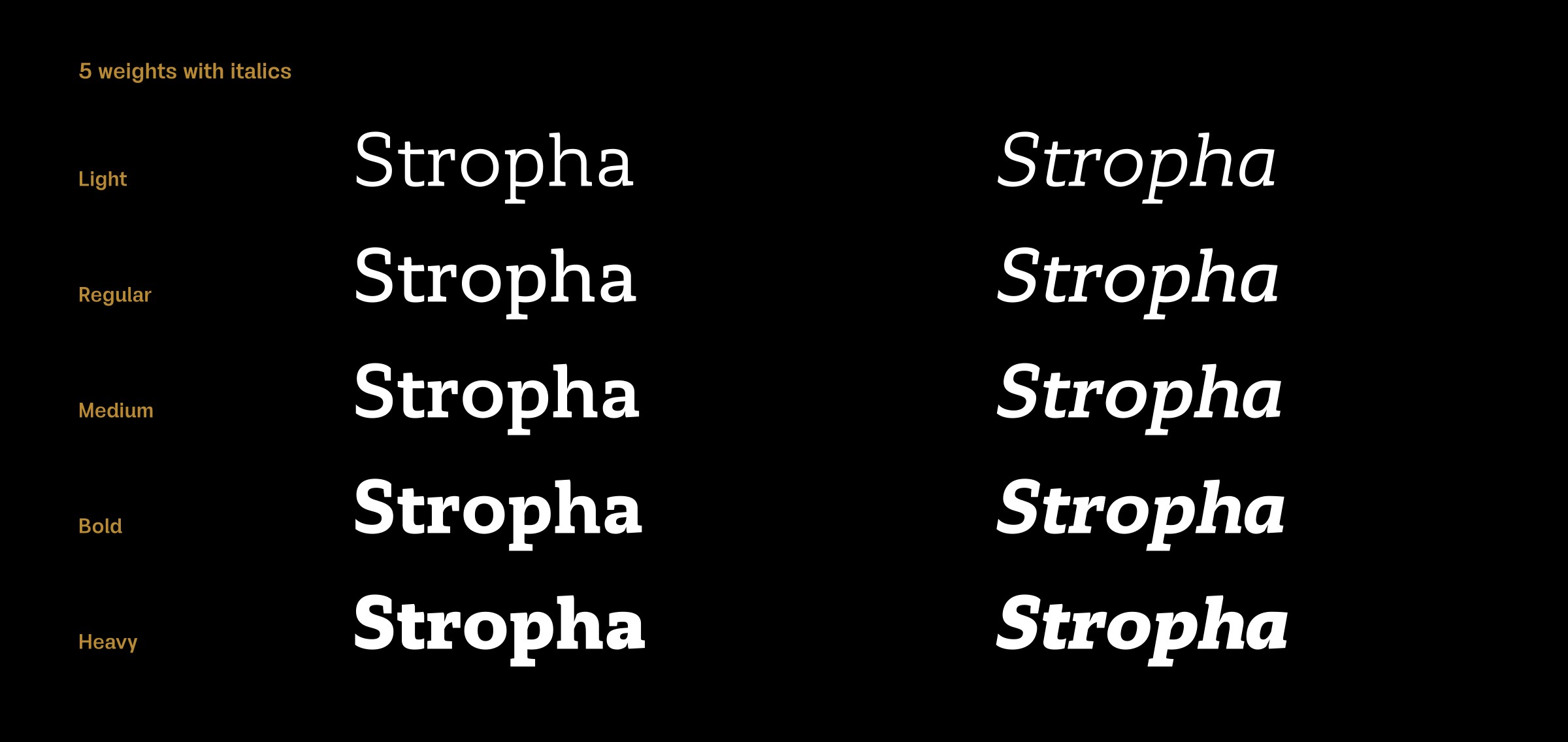
I think Stropha has good rhythm and it’s fairly balanced, which is important, because it’s what gives the total impression of a typeface, no matter how original it is or not. And last, with all its details and characteristics, Stropha ended up neutral and pretty much a universal family that works well in small sizes, while in bigger sizes those distinctions bring a dose of display touches into titles.
Originally published on the Identifont blog. Questions by David Johnson-Davies, answers by Dušan Jelesijević.
The font
Stropha in the catalogue, with the full specimen, glyph set and licences.