Interview about Xperiment Sans font family – Identifont
Dušan Jelesijević01 Mar 2023
As its name suggests, Xperiment Sans is an experimental sans-serif typeface. What inspired you to design it?
I wanted to have a typeface in our catalogue that goes beyond certain boundaries, as we usually don’t design this kind of typeface – where we push the design of the characters beyond standard or common shapes. I had worked in the past on a couple of similar concepts, but never completed any of them, but with Xperiment Sans I felt it could look interesting with all its distinctive features.
Did you design Xperiment Sans directly on the computer, or did you start by sketching characters on paper?
For the last couple of years I have been starting each typeface with sketches on paper. Before that I used to work directly in FontLab, drawing everything in digital form, but I found it works better and much quicker for me when I draw something on paper first. Paper gives me possibility to quickly explore all the ideas, while the digital method would take me a bit more time for the way I work.
Xperiment Sans is reminiscent of ITC Bauhaus Light in its experimental approach. Was that an influence on you?
Now you mention it I guess there are certain similarities between them. I didn’t have ITC Bauhaus Light in mind while I was working, but now I can say Xperiment Sans could be a kind of new version of Bauhaus. The influence was in my notebook when I was looking through some old doodles of lettering.
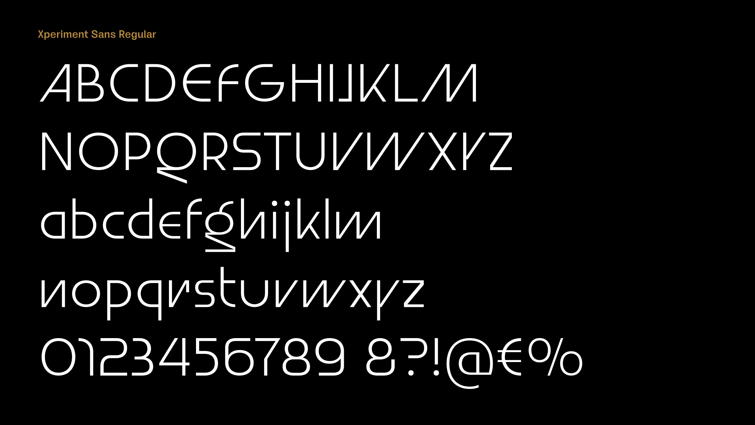
Even for an experimental typeface some of the characters are decidedly eccentric, such as the ‘J’, ‘Y’, ‘g’, ’n’, and ‘r’. So perhaps the typeface will be most appropriate for applications such as avant-garde magazines and art installations. Is that what you had in mind?
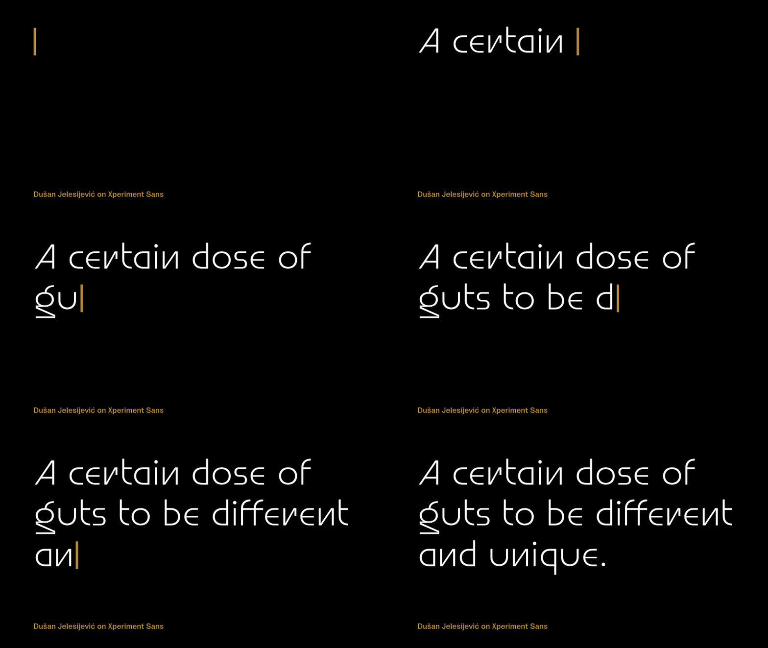
The idea with Xperiment Sans was to be a typeface for modern projects and people who would like to try something different from their competition. To have a certain dose of guts to be different and unique. Like uncommon IT companies, brands that work with specific modern products like hi-fi, appliance, and consumer electronics manufacturers, album covers for electro genres of music, and all contemporary usages where Xperiment Sans would be great creative support.
Originally published on the Identifont blog. Questions by David Johnson-Davies, answers by Dušan Jelesijević.
The font
Xperiment Sans in the catalogue, with the full specimen, glyph set and licences.