Interview about Epopeya font family – Identifont
Dušan Jelesijević01 Feb 2026
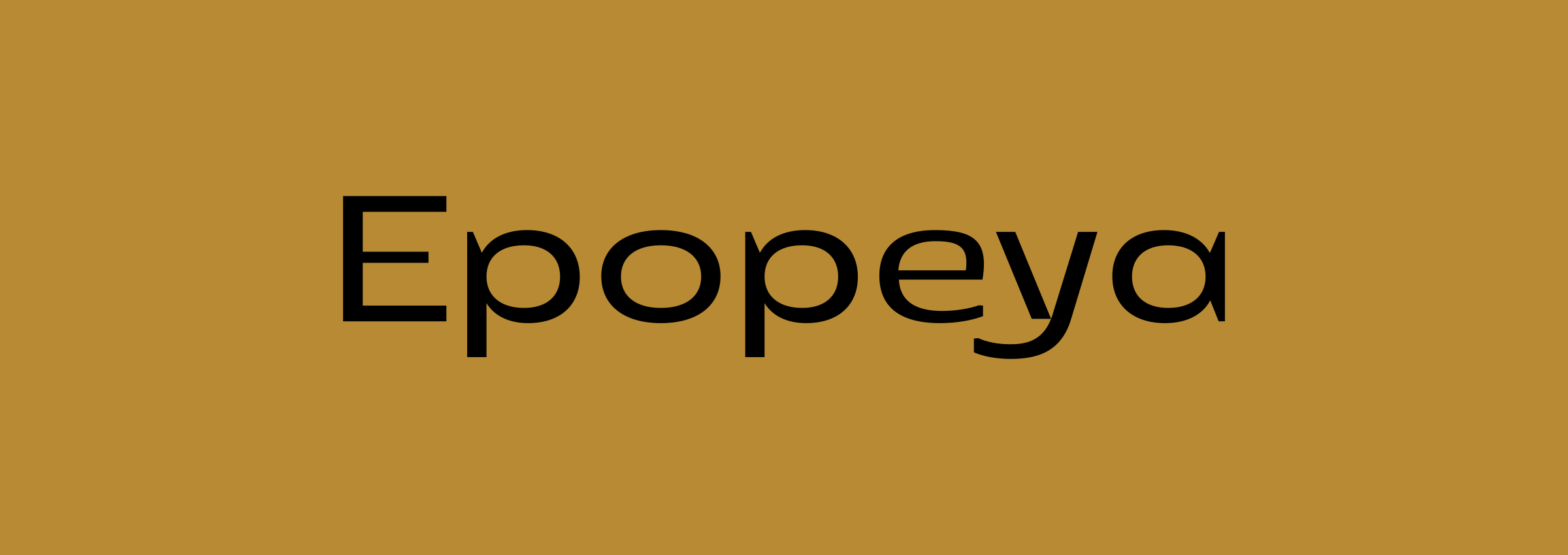
Epopeya is an unusual geometric sans-serif typeface in eight weights. What led you to design it?
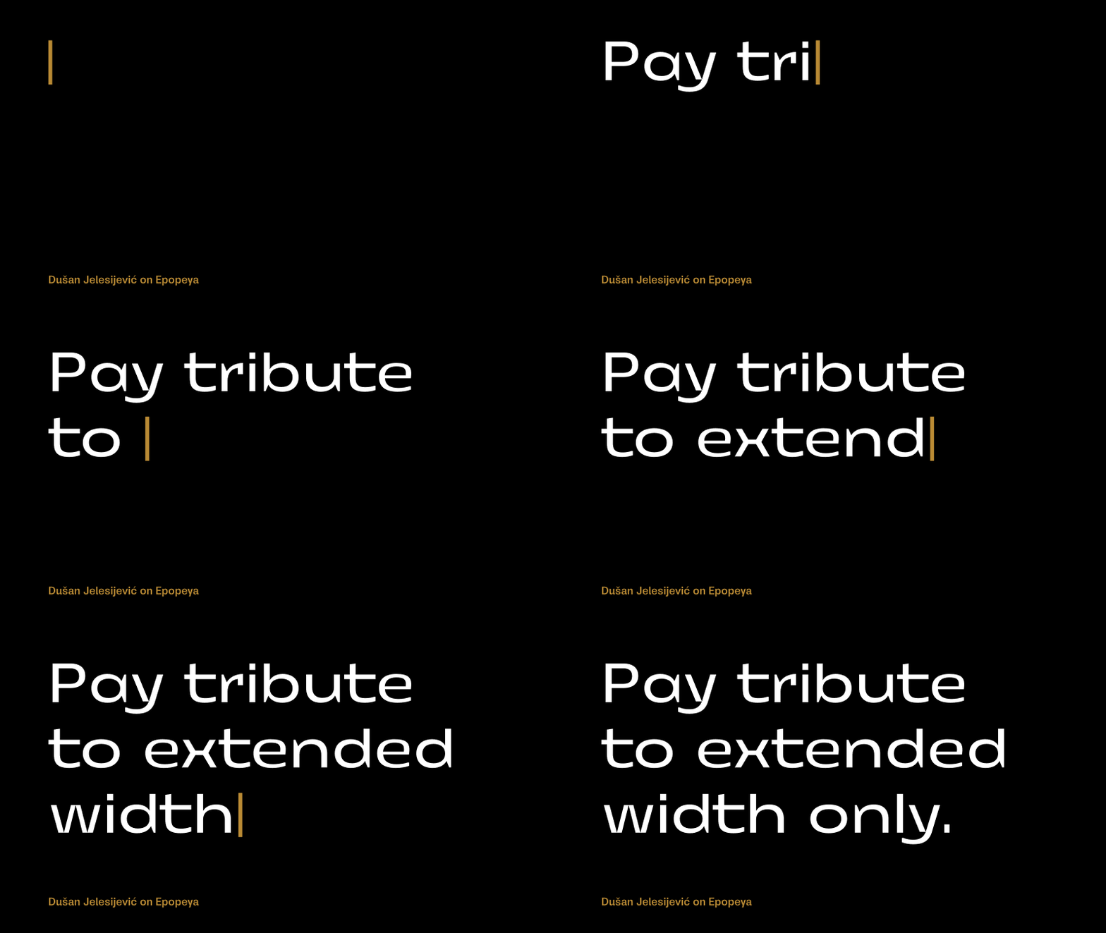
For a long time I've been thinking of designing a wide, modern-looking family, but left the idea for later because condensed-width typefaces seem to be more versatile and interesting for the market. So, this time I wanted to pay tribute to extended width only; plus, we didn't have something similar in our font catalogue.
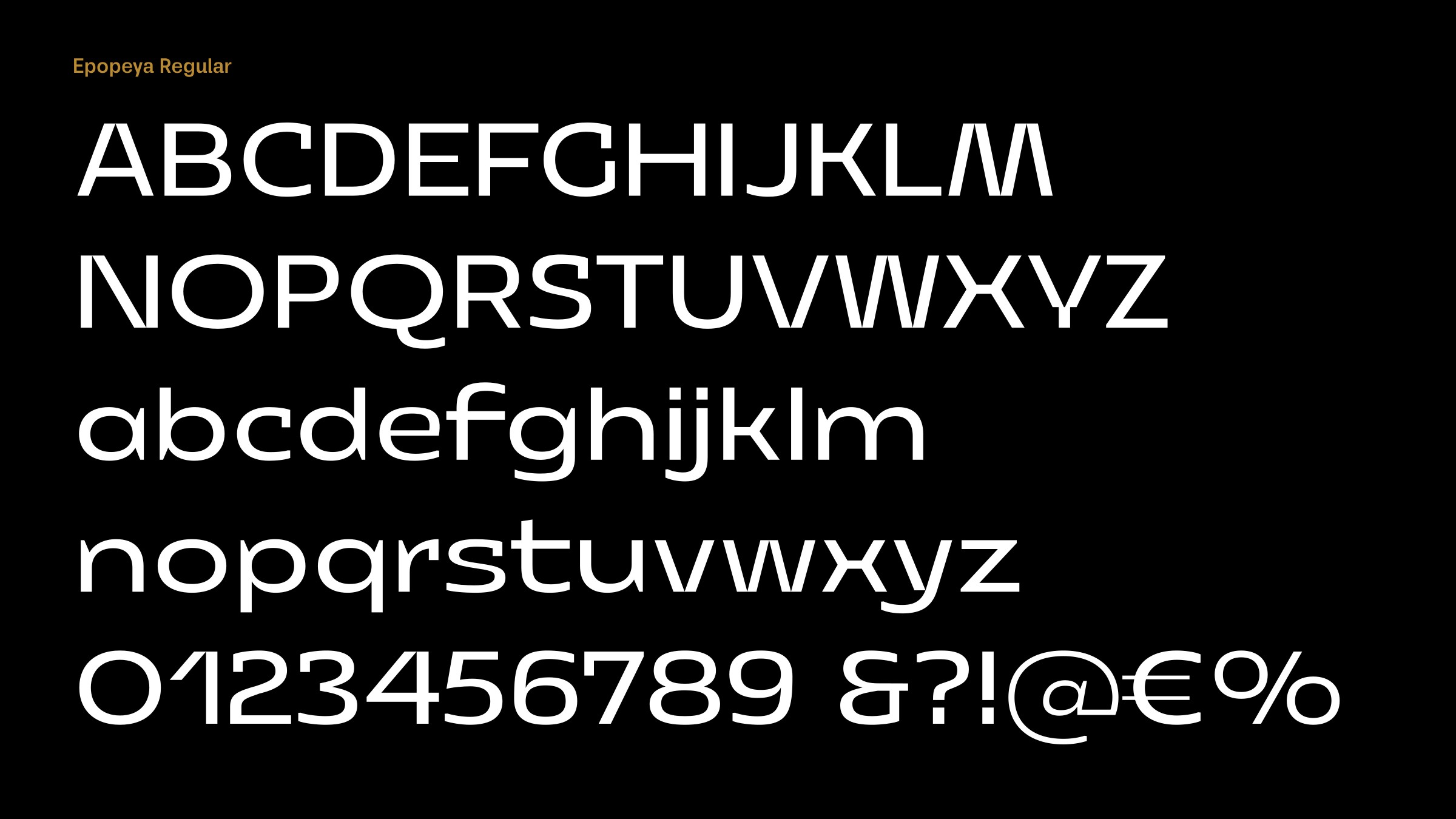
Epopeya is distinctive in the way there’s a visual conflict between the block-shaped letters such as the ‘A’, ‘M’, ’W’, and ‘X’, and the spiky terminals on letters such as the ‘a’, ‘m’, ‘r’, and ‘q’. Where did the inspiration for this originate?
Instead of inspiration I would say it was more like need, an urge to have something unique in the sans-serif category, as it is becoming very hard to design something fresh and new nowdays. It's quite a challenging job to design sans-serif in the oversaturated font market, if you want to make something recognisable. So, Epopeya combines a few concepts, and you've mentioned a couple of them: block-shaped letters, spiky terminals, ink-traps, and slab serifs as in ‘S’, ‘C’, and ‘G’. All spiced with display elements of letter architecture, and avoiding classical sans-serif shapes: for example ‘1’, ‘S’, ‘X’, and ‘Y’.
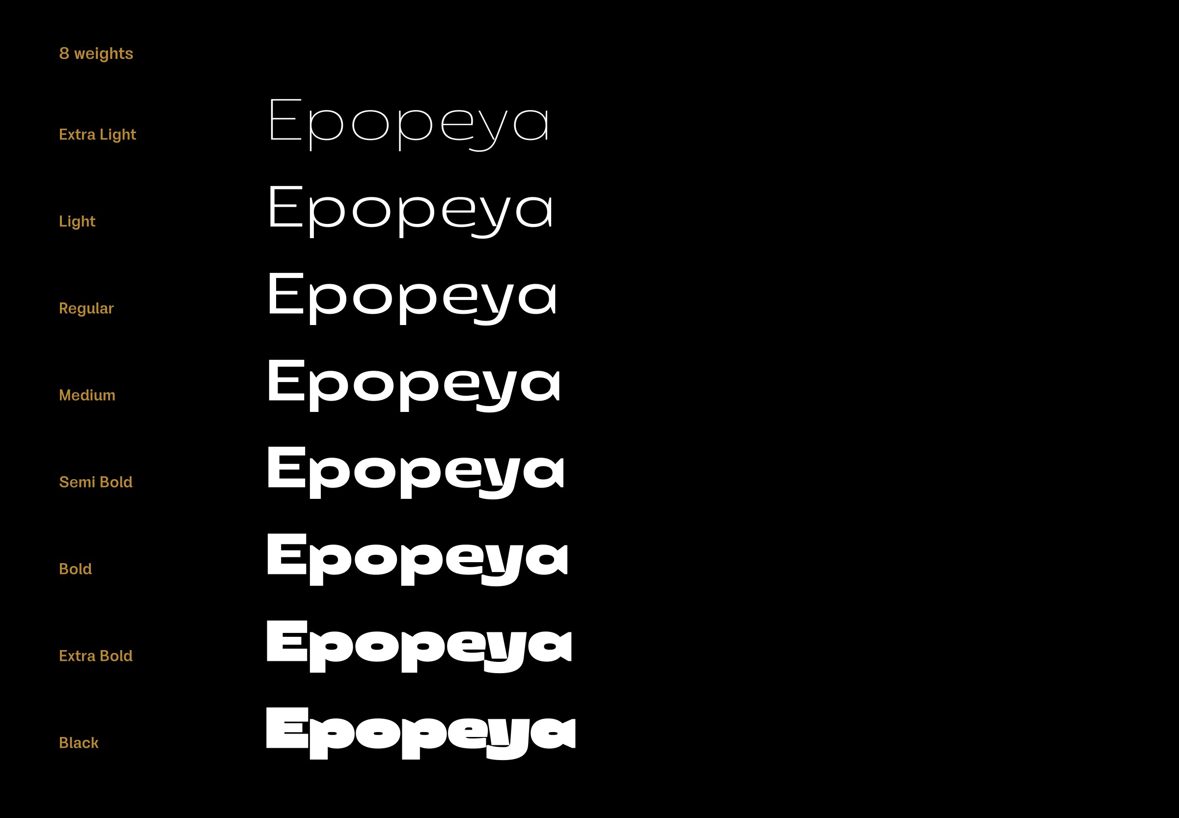
It’s impressive that you’ve managed to keep the visual character of Epopeya very consistent across the full range of weights, from extra light to black. Two ways you’ve achieved this is to truncate the top of the ‘A’ and reduce the slant of the terminals in the heavier weights. Did you arrive at these ideas from experimentation, or did you plan them from the start?
The slanting of the terminals was more a necessity. As you say, the angle changes as the weight gets thicker because the letters become darker, and it's more difficult to achieve legibility in the smaller sizes. On the other hand, cutting the top off the ‘A’ and other characters was planned from the start, as part of the design. Since we've close to 150 font families in our catalogue, it's a challenge when working on a new family not to repeat yourself. With Epopeya, I think we succeeded.
Originally published on the Identifont blog. Questions by David Johnson-Davies, answers by Dušan Jelesijević.
The font
Epopeya in the catalogue, with the full specimen, glyph set and licences.