Interview about Monden font family – Identifont
Dušan Jelesijević01 Nov 2022
Monden is quite a quirky font; what led you to create it?
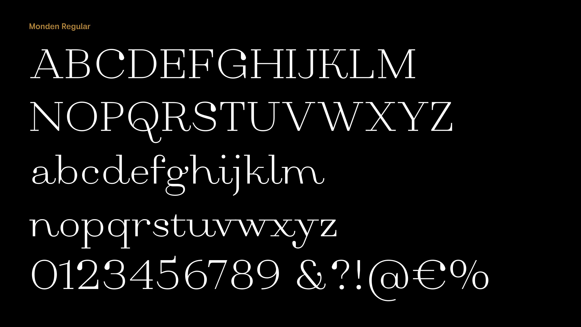
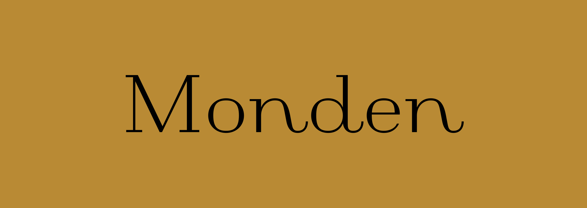
To be honest, as with many previous releases, I just sat and made it without any previous plan or idea of what it should look like at the end. I agree it’s quirky – it combines a sort of Didone style without bottom serifs with display elements, and it looks surprisingly distinctive in my opinion; even more than it should be. I think its distinctiveness probably limits its area of use.

Monden is a bit reminiscent of Roman typefaces from the early 1900s, such as Packard Patrician NF. Were you influenced by classic fonts from this era?
There were no design influences that I’m aware of. Packard Patrician NF might be closer by design to my other release – Bottled Moon – as Monden gives the impression of less freedom in terms of some of the calligraphic elements that Packard Patrician NF and Bottled Moon contain.
A distinctive feature of Monden is the teardrop on letters such as the ‘C’, ‘G’, and ‘S’, and the italic ‘s’, ‘w’, and ‘x’. What inspired you to incorporate this feature?
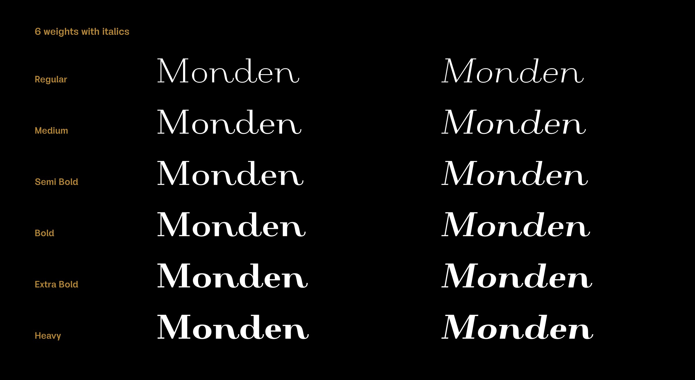
Instead of inspiration, I’d say it was more the urge to add something that would make it more unique, and the teardrops gave a dose of contrast to the strict stems; they visually added more flavour in words composed with Monden. Those teardrops, the curvy endings, and the really decorative italic shapes, are all visual characteristics of Monden.
The teardrops caused some complications during design, especially in the heavier weights as they were positionally close to some parts of the letter which could cause letter blackness and visual stuffiness.
In retrospect I would describe Monden as a Didone with hairstyle bangs in a couple of colours and asymmetric cuts.
Originally published on the Identifont blog. Questions by David Johnson-Davies, answers by Dušan Jelesijević.
The font
Monden in the catalogue, with the full specimen, glyph set and licences.