Interview about Nowina font family – Identifont
Dušan Jelesijević01 Aug 2024
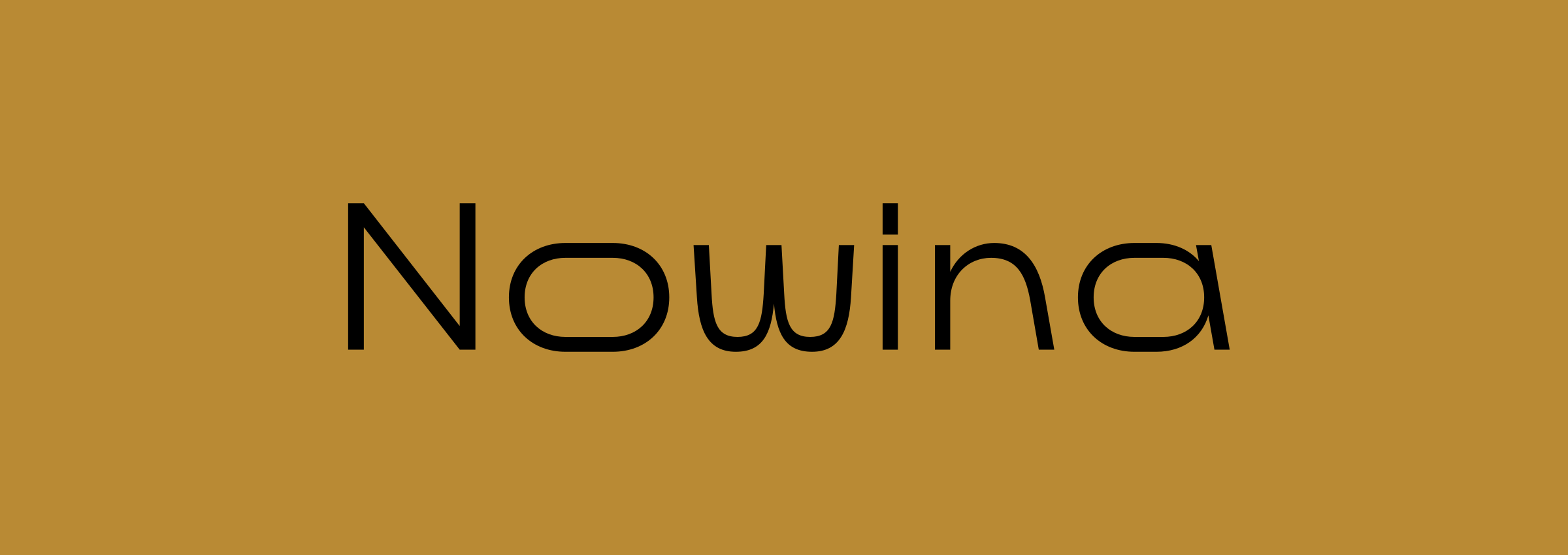
Like many of your fonts, Nowina defies classification; what gave you the idea for its design?
I was experimenting with my earlier Displayer font family with the idea of creating some kind of display sans family where the base design was a sans serif, but it would achieve its distinctive character from the addition of some wacky display features. So, I could say that the inspiration for Nowina was Displayer.
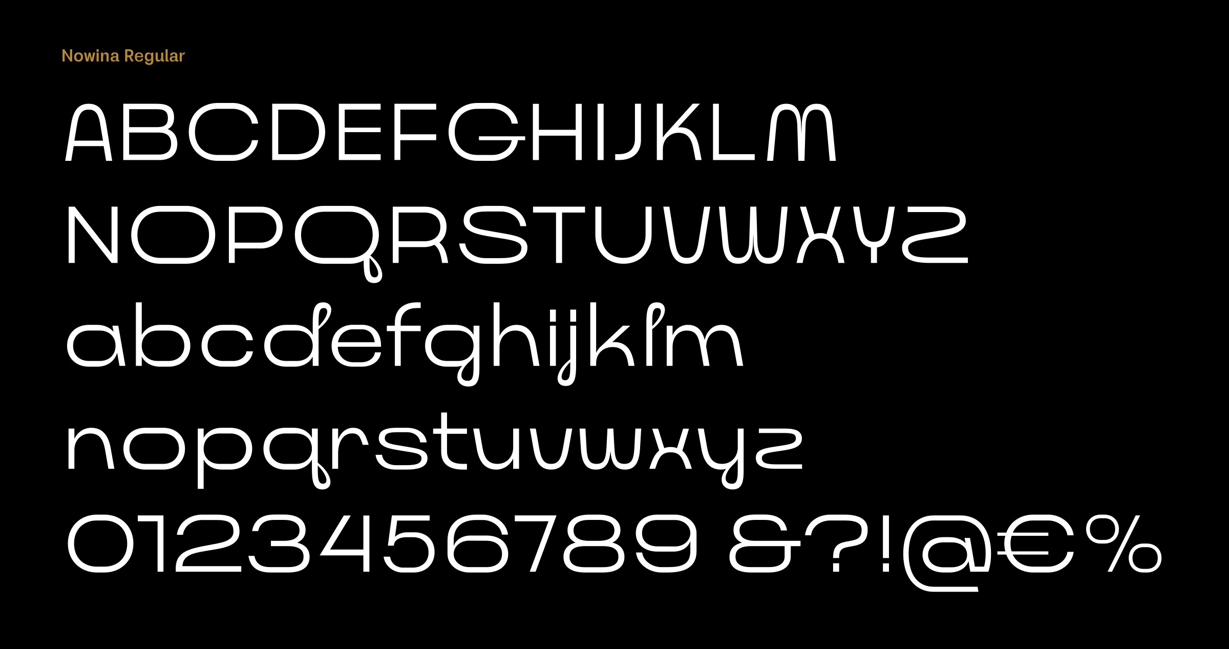
One of the distinctive features of Nowina is the loopy tail on the ‘Q’, ‘j’, ‘g’, ‘and ‘y’, which is echoed on the ascender of the ‘d’ and ‘l’. What inspired this feature?
At one stage I was looking for some kind of novel design feature, and these loopy tails somehow ended up as a good solution. It gives the whole design another level of complexity, without reducing the legibility. My only concern was whether it would work in the black weight, but it looks pretty nice in my opinion.
Another distinctive feature of Nowina is the curved vertices on letters such as the ‘A’, ‘M’, ‘V’, ‘W’, and ‘Z’. Was this inspired by any other particular fonts?
Yes, those curved vertices seemed like the logical extension of the loopy tail idea in the way that they are also rounded, soft, curvy features, and so they work well together. We have a couple of other families in our catalogue that have curved vertices, Ancress and Oblik, but Nowina is probably the most extreme example. Apart from these features Nowina is a pretty simple sans serif design.
Nowina looks as if it would be at home as the corporate typeface for a modern retail brand. Is that the sort of application you had in mind?
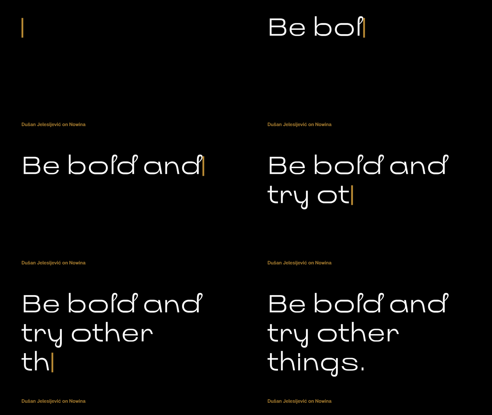
You’re right. It’s for modern brands, specifically for designers and companies that are open minded about being different. I think that many good fonts end up being overlooked because they are too unusual. It’s human nature, especially in business, that most clients don’t want to take a risk and so they go with safe solutions in every point. Be bold and try other things; that’s how you’ll become a real brand!
Originally published on the Identifont blog. Questions by David Johnson-Davies, answers by Dušan Jelesijević.
The font
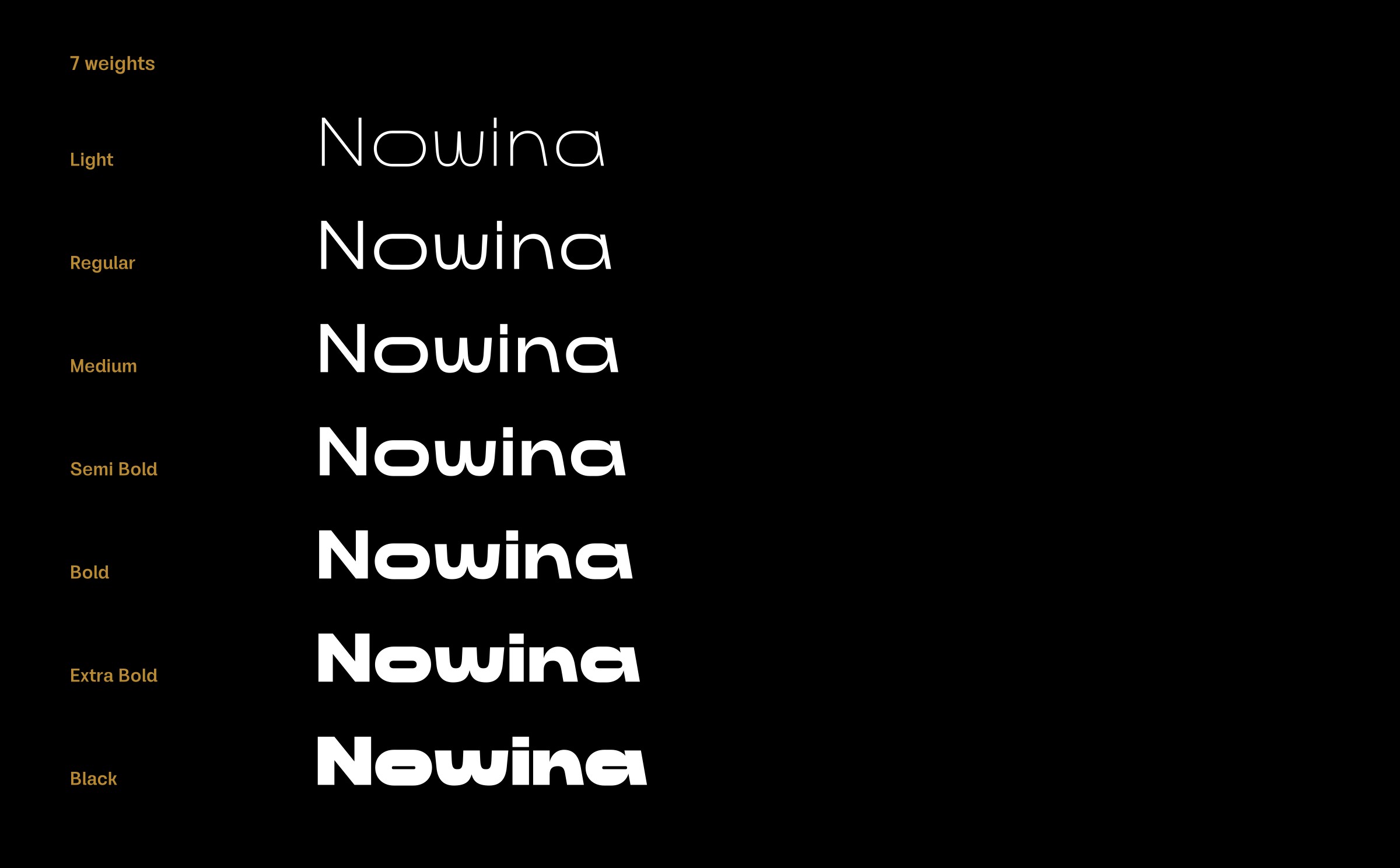
Nowina in the catalogue, with the full specimen, glyph set and licences.