Interview about Prego font family – Identifont
Dušan Jelesijević01 Mar 2021
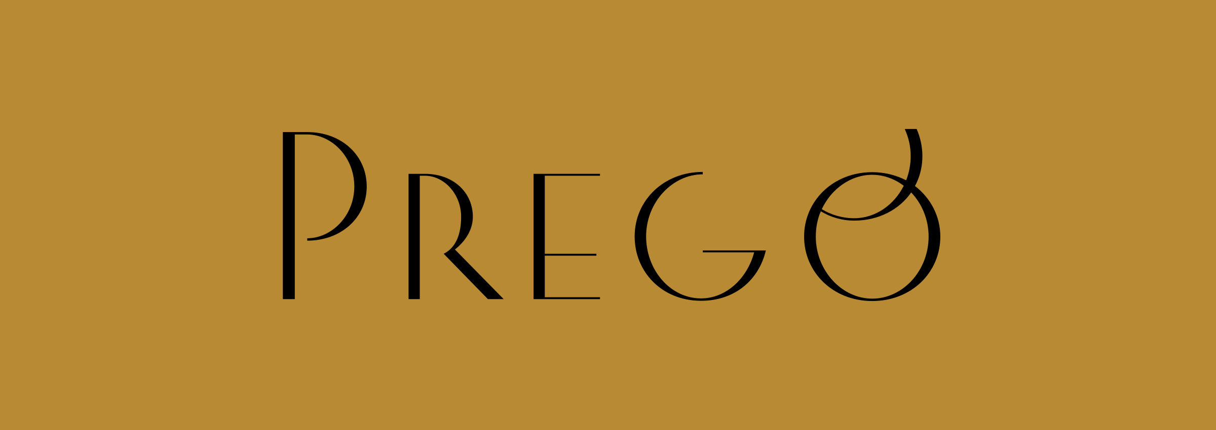
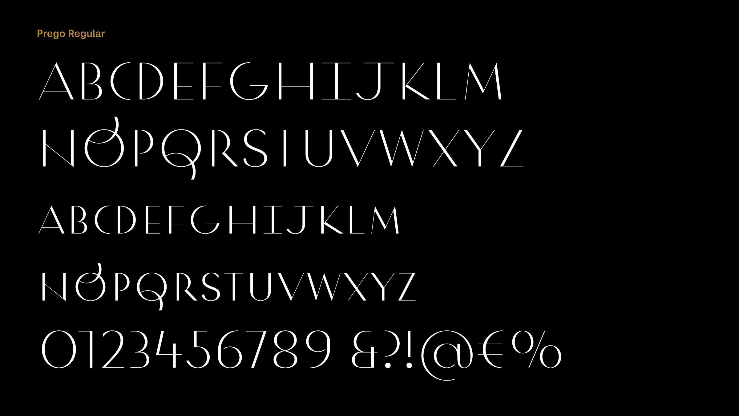
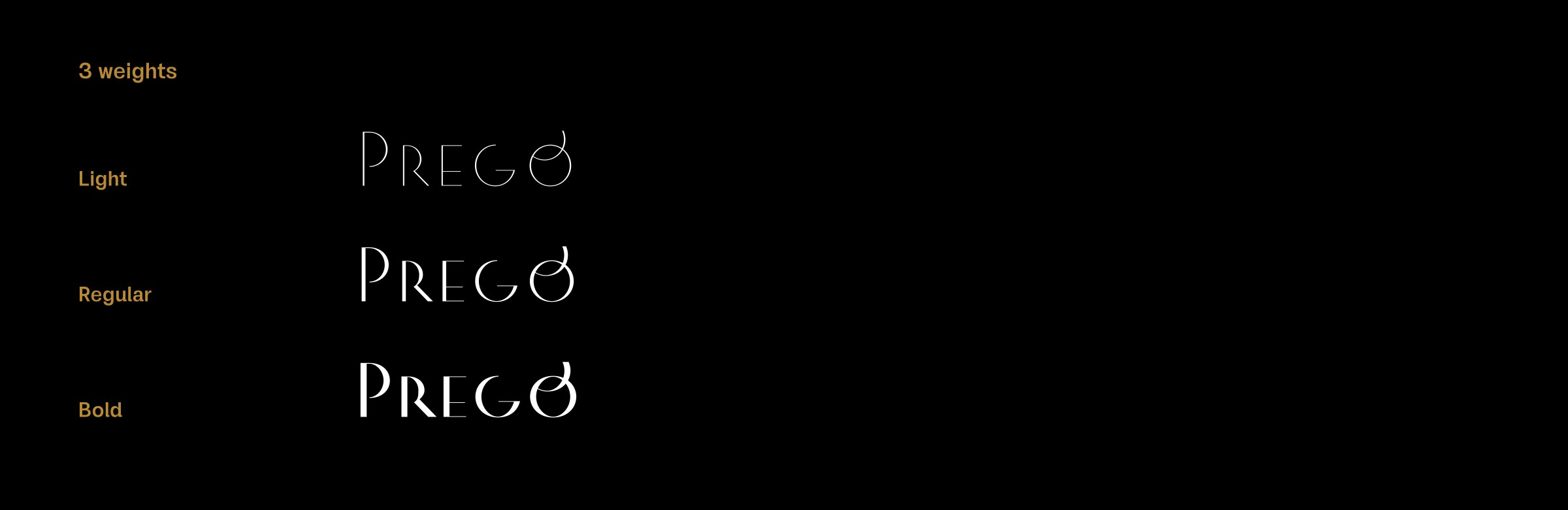
Prego has a distinctive Art Deco look to it, a bit reminiscent of Morris Fuller Benton’s Parisian, or Holly Goldsmith’s ITC Vintage. Were Art Deco fonts an influence on the design?
Yes, they were. I find the Art Deco style very inspiring, very open for design experiments in typography, as it can fit into almost every design project and bring a classy look to it. It’s always in fashion, no matter what the current typographic trend is. With Prego we tried to avoid the more highly decorated Art Deco styles, so you can compose paragraphs with it and not worry that it will visually attack other content on the page or get all the attention of the reader.

Prego looks like it would be suited to display use in applications such as fashion advertising, magazines, and book covers. Did you have applications in mind when you designed it?
When I designed Prego I had a picture in mind: it’s a sunny summer day, late afternoon, you are at the Italian seaside, lying on an easy chair on a second-floor terrace, with fresh salad on the table and good wine, good cheese, and thin slices of prosciutto – you get the feeling! Prego is the font I would use on design materials to conjure up that atmosphere – pure hedonism.
Prego has some unusual features, such as the low junction on the ‘N’, and the ‘Q’ tail. What gave you the inspiration for these features?
It’s a feature of many of the letters that they tend to have stability closer to the baseline; for example, the ‘A’, ‘B’, ‘E’, ‘G’, ‘H’, ‘K’, ‘X’, etc. The tail on the ‘Q’ is a little touch that adds a decorative element to Prego’s design. It was inspired by script fonts, and more examples are available in the Contextual Alternates.
I understand that Serbian uses both Cyrillic and Latin alphabets, and so as a Serbian font foundry your fonts usually include both character sets. With a font like Prego do you design the Latin characters first, and then create matching Cyrillic characters?
Yes, we in Serbia use both alphabets equally (the term of using more than one writing system is known as digraphia). In practice, because of the Internet and globalization that’s present everywhere around us, Cyrillic is almost totally overpowered by the Latin alphabet. There is another reason why Cyrillic is fading away in Serbia: there’s no national plan or idea about it, and to me as a type designer, it’s almost a waste of time to develop Cyrillic typefaces. In the long term, there’s no positive outlook for Cyrillic in Serbia, at least as far as I can see.
Back to Prego. I always design the Latin characters first, not because I like Latin more than Cyrillic, but because we primarily design Latin typefaces. To a native Cyrillic designer, it’s not a big job to design Cyrillic versions; most of the basic shapes are in the Latin characters, although on average Cyrillic letters are a bit wider than Latin ones. The main problem when designing Cyrillic is localization – are you designing Cyrillic for Serbs, Macedonians, Bulgarians, or Russians? As the biggest country, Russia is the biggest Cyrillic font market, so it would be logical to design Cyrillic for Russians. Until we get official Unicode values for all the Cyrillic variations, things will probably remain messy.
Our blog post on Serbia and Yugoslavia between WWI and WWII gives a short introduction to how things worked in ex-Yugoslavia politically and economically, and how Cyrillic looked between the two world wars in this area.
Originally published on the Identifont blog. Questions by David Johnson-Davies, answers by Dušan Jelesijević.
The font
Prego in the catalogue, with the full specimen, glyph set and licences.