Interview about Rebuke font family – Identifont
Dušan Jelesijević01 Oct 2025
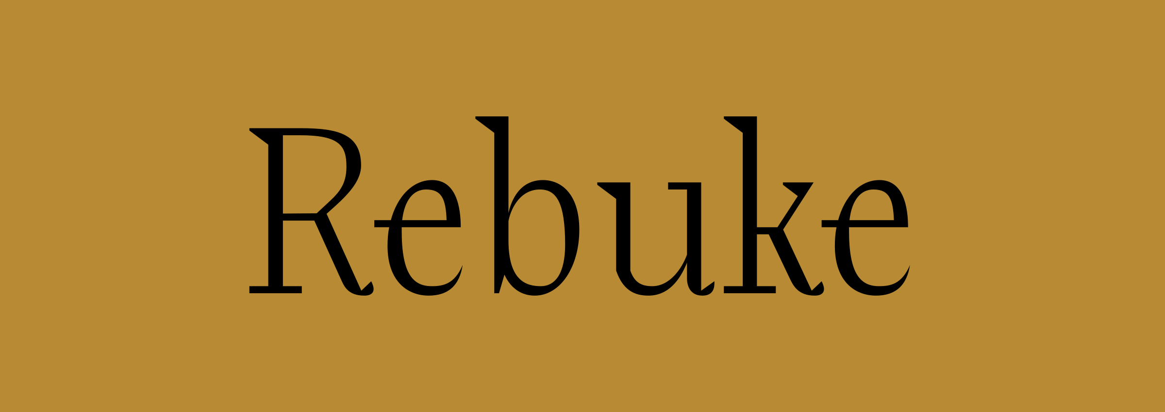
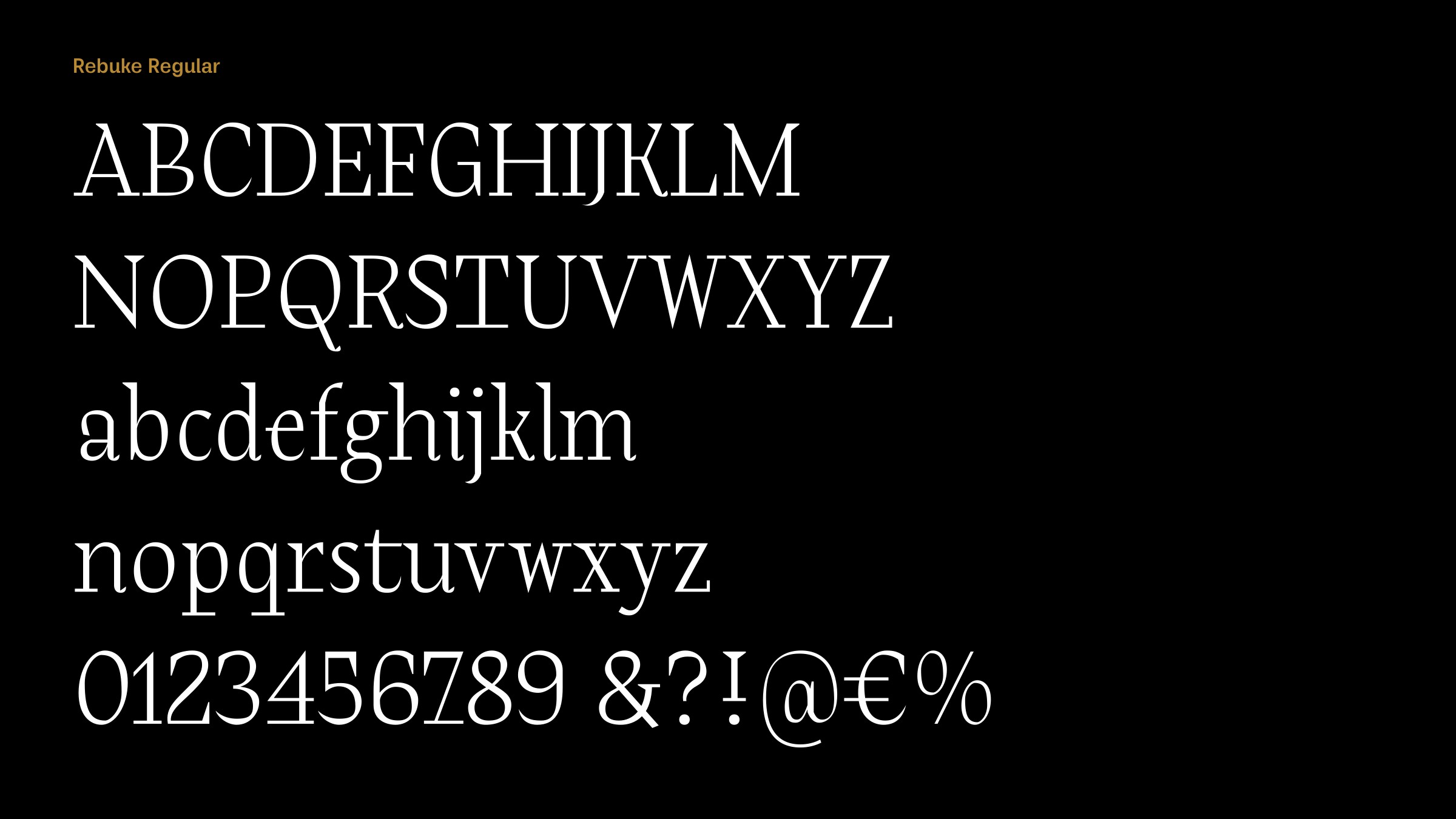
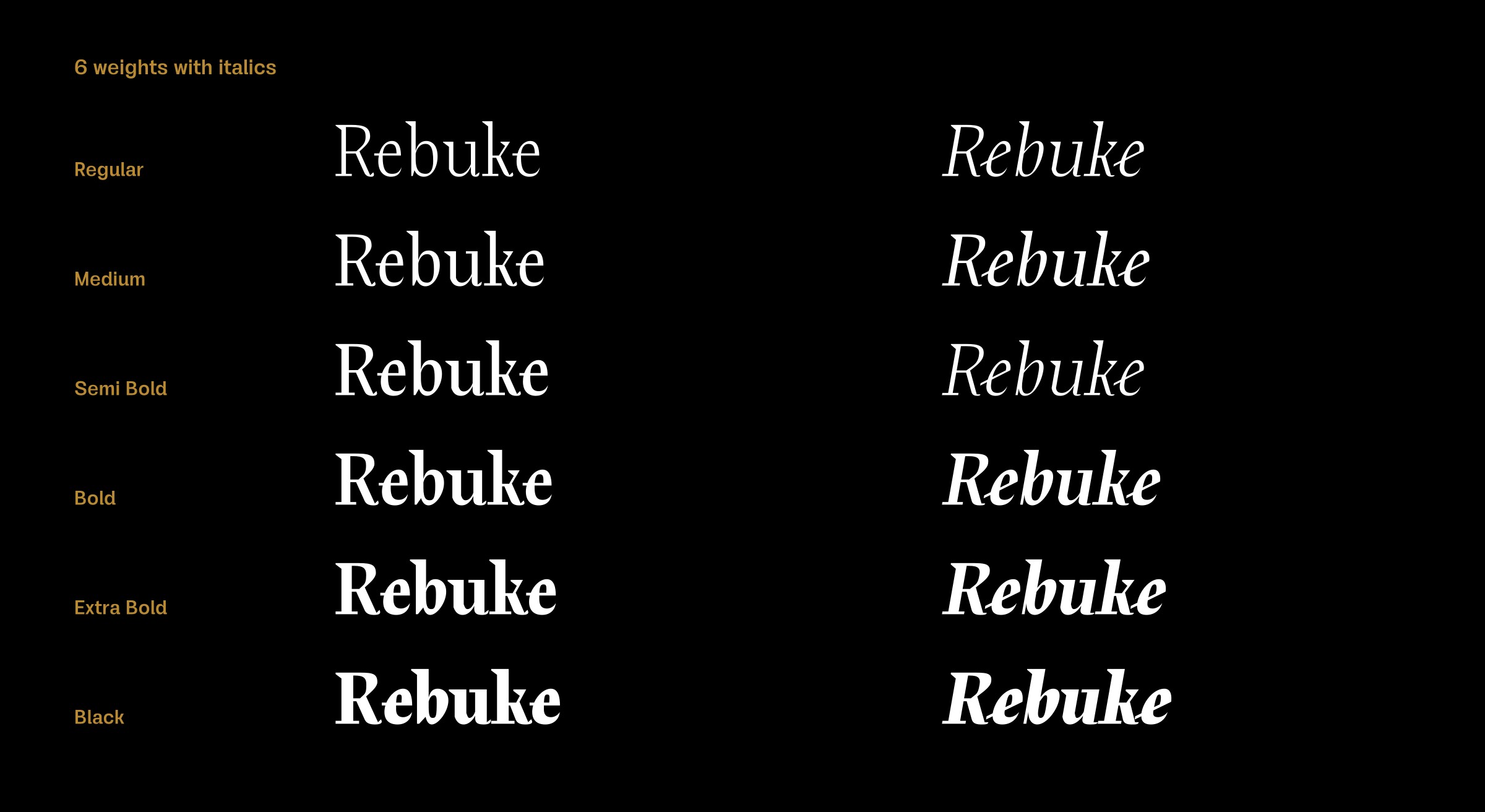
Rebuke is a serif font in six weights, from regular to black, and italics. Where did the idea for the typeface originate?
The idea came from playing in FontLab. After creating the usual shapes of a few letters in the Didone style I was looking for a twist in the design, something that will make the design recognisable. The breakthrough was when I found a design style that worked well on most of the letters.

Rebuke has a calligraphic look, as if it was hand drawn with a pen and ink. Did you draft it on paper before digitising it?
No, I didn't. It was completely made on the computer. It's mixture of a few styles; there are elements of Didone, calligraphy, and modern serif fonts.
Rebuke Black reminds me a bit of an early Bitstream font, Sprocket. Was that, or any other font, an influence on Rebuke?
They have some of the same vibes, but there wasn't any influence, at least as far as I'm aware. I might have seen something somewhere and applied it unconsciously in Rebuke.
One of the distinctive features of Rebuke is the long baseline bars on the ‘F’, ‘P’, ‘T’, ‘p’, ‘q’, ‘r’, ‘4’, and ‘7’. What inspired this feature?
At first it started with the serif extension to the right on the ‘r’ in order to give more stability to the letter, but then I decided to exaggerate it and apply the same idea to some other letters as well. Some of the letters you mentioned didn't need it as part of the design, but I felt it would be a nice addition in overall font recognition. These extensions fit in with the calligraphic nature of the design, like the extended bar on the ‘e’. Rebuke is probably not an easy font family to use in an application as it contains a lot of characteristics that many designers or other users might find just too aggressive. But I did it with a lot of love and I'm really satisfied how it looks – I can recognize it anywhere when I see it.
Originally published on the Identifont blog. Questions by David Johnson-Davies, answers by Dušan Jelesijević.
The font
Rebuke in the catalogue, with the full specimen, glyph set and licences.