Interview about Revia font family – Identifont
Dušan Jelesijević01 Apr 2024

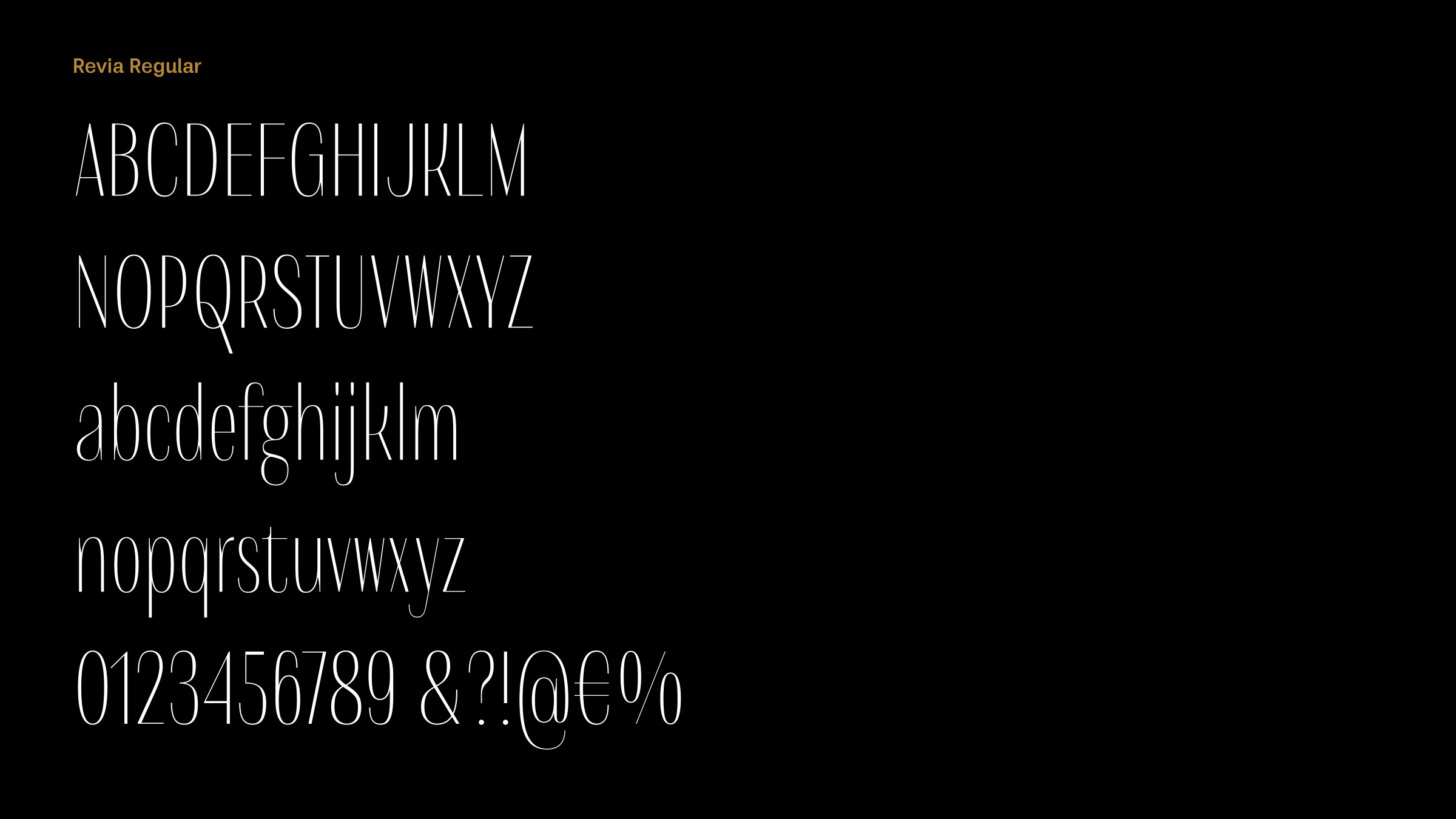
Revia is an elegant high-contrast condensed sans-serif typeface; what inspired you to design it?
There was no specific inspiration. For some time, I had the idea of creating a condensed family without a normal width. It seems that there are more possibilities for new design ideas in condensed font families in this category of fonts.
It’s a sign of Revia’s originality that I can’t find anything similar to compare with it on Identifont. Were you influenced by any other fonts?
That's nice to hear. I think that's the biggest compliment a type designer could get. After creating Revia I realised that it reminded me of our Fazon font family. Although the families differ in most points, there is a small connection in their slightly condensed widths, and the design of the junction between their shoulders and vertical stems in characters such as the ‘n’, ‘m’, and ‘h’.
Revia’s character is most visible in the bolder weights, Revia Bold and Revia Black. What sequence did you design them in?
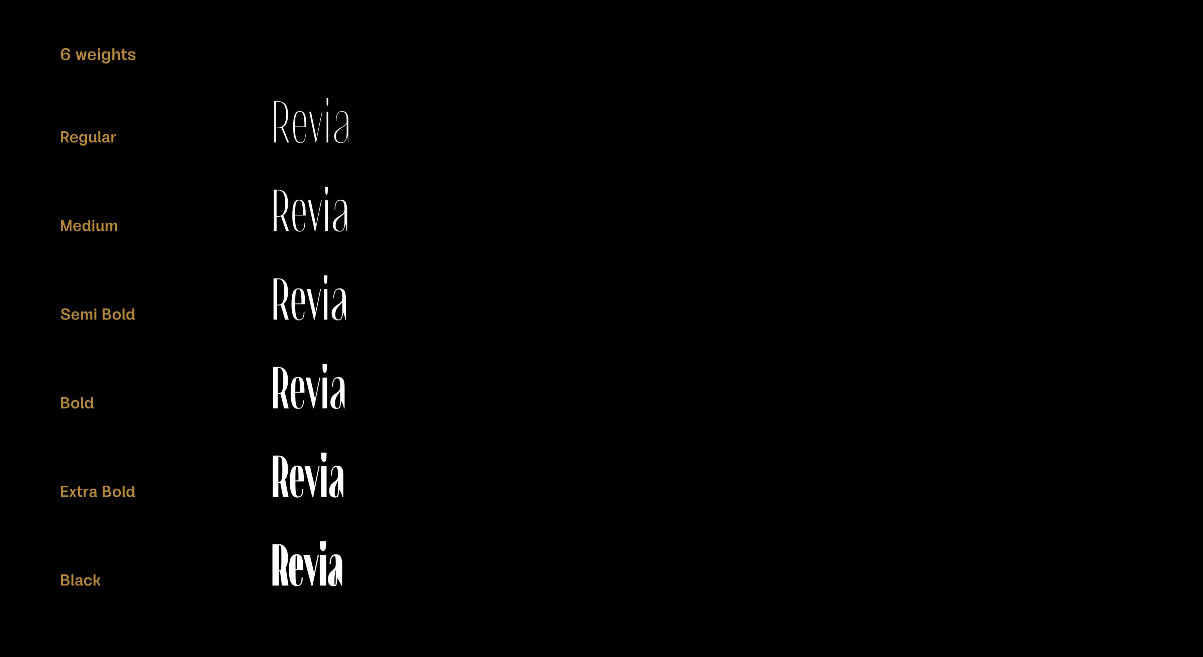
Revia was made as a variable font. The regular and black weights were designed first, while the intermediate weights were slightly edited and tuned before generating the font files. I gave the black weight tighter spacing, greater contrast, and balanced the white counters within the letters; these are the biggest visual differences between the thinner and thicker weights in Revia.
Did you have any particular applications in mind when you designed Revia?
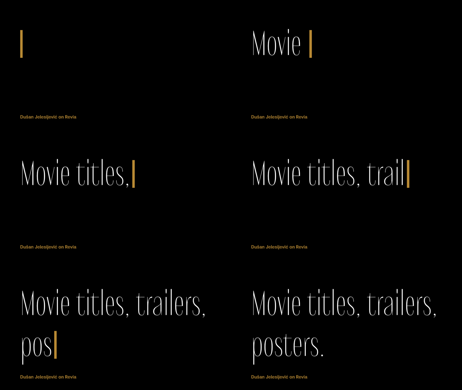
Revia was designed to be used primarily at bigger font sizes because of its contrast, but I believe it can be safely used in most situations now. I would like to see it as movie font, for movie titles, trailers, posters etc.
Originally published on the Identifont blog. Questions by David Johnson-Davies, answers by Dušan Jelesijević.
The font
Revia in the catalogue, with the full specimen, glyph set and licences.