33% OFF
Povetarac Sans font family is part of Povetarac Superfamily together with Povetarac Didone and Povetarac Didone.
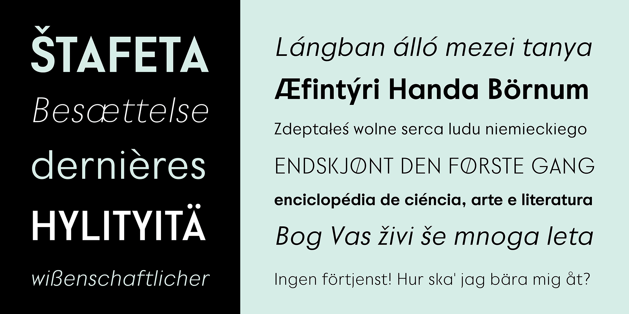
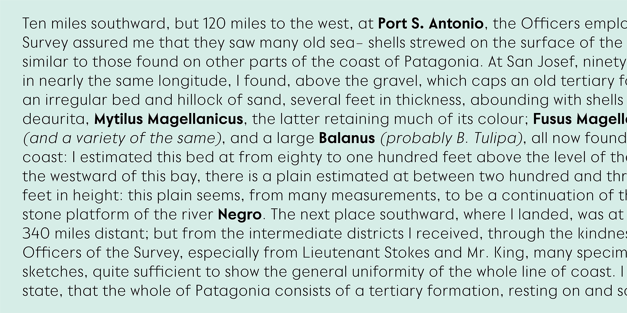
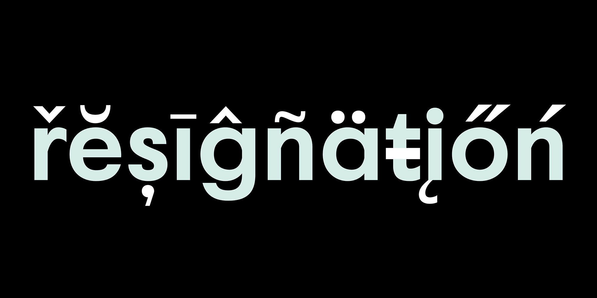
Available in 6 weights with matching italics, Povetarac Sans relays on lively uppercase proportions that took inspiration from vintage typefaces. It is well balanced, elegant and fully recognizable sans serif family. With sharp overhang, Povetarac Sans works pretty well in all situations – from editorial use to branding, websites or just titles.
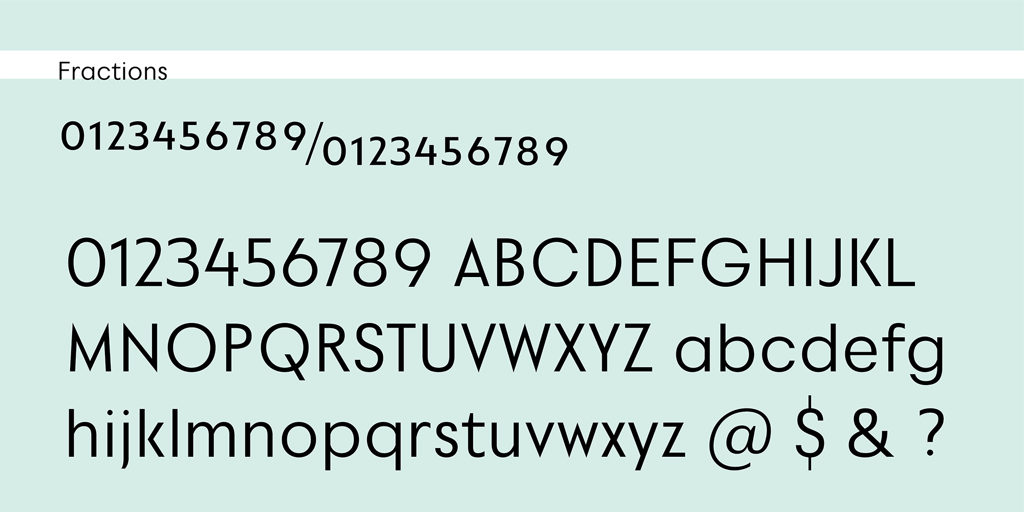
Comes with Fractions and extended Latin character map.
from $17from $2533% off/ style
Choose a style ❯Classification
Sans-Serif
Styles
12 styles
Language Support
Extended Latin
OpenType
Standard Ligatures, Stylistic Set 1
Designer
Dušan Jelesijević
Yeah, I made this!

Released & Version
01 January 2022, v1.000
All Styles
Regular
Regular Italic
Medium
Medium Italic
Semi Bold
Semi Bold Italic
Bold
Bold Italic
Heavy
Heavy Italic
Black
Black Italic
Specimen
SizeS
LeadingL
TrackingT
S
L
T
he paid her forty a week
SizeS
LeadingL
TrackingT
S
L
T
But there was a diversion at hand. Ellis Hardy was approaching and she knew without being told what was about to happen.
SizeS
LeadingL
TrackingT
S
L
T
complete with accessories and a year's supply
SizeS
LeadingL
TrackingT
S
L
T
Hardy grinned his sour grin and stepped out, giving Mr. Firrel but the curtest nod in passing. Firrel came in, and not being invited to sit, stood awkwardly before the desk.
SizeS
LeadingL
TrackingT
S
L
T
Maizie noticed that his knuckles were white and his hands tense.
Paragraphs
S
L
S
L
She was golden, from the hair wound and braided so smoothly about her head, to the gold kid slippers on her small and fragile feet. Her dress, of some soft, glistening, silky stuff, was a deeper shade of the same gold, her soft, delicate skin seemed almost to be touched with a faint, powdery, golden dust. He failed to register, and never could recall, the color of her eyes. Perhaps, they were golden, too.
S
L
S
L
This completed, the agent hurries on, each day a constant round of contracts. A single item may bring its difficulties: suppose, in the year that has passed since his last visit, the usual show grounds has been cut up into building lots! He must find another, fully five hundred feet square, fairly level, rentable at a reasonable price, not too far from the center of town and easily reached by main trunk car lines. It isn't easy. But he does it.
S
L
S
L
Ben Holt was a poor boy, and at the time when he first gained his good name, he had never seen such a thing as a green field in the country. As to buttercups and daisies, they would have been looked upon quite as "treasures of silver and gold" by the little boy who had lived all his life in a London alley. This alley was so narrow, that the utmost he could see even of the blue sky of heaven was a small strip between the two rows of tall, dirty houses, which were so close together that a person living at one side of the alley could almost shake hands with his opposite neighbour from their respective windows.
S
L
S
L
I have data upon data upon data of new lands that are not far away. I hold out expectations and the materials of new hopes and new despairs and new triumphs and new tragedies. I hold out my hands to point to the sky—there is a hierarchy that utters me manacles, I think—there is a dominant force that pronounces prisons that have dogmas for walls for such thoughts. It binds its formulas around all attempting extensions.
S
L
S
L
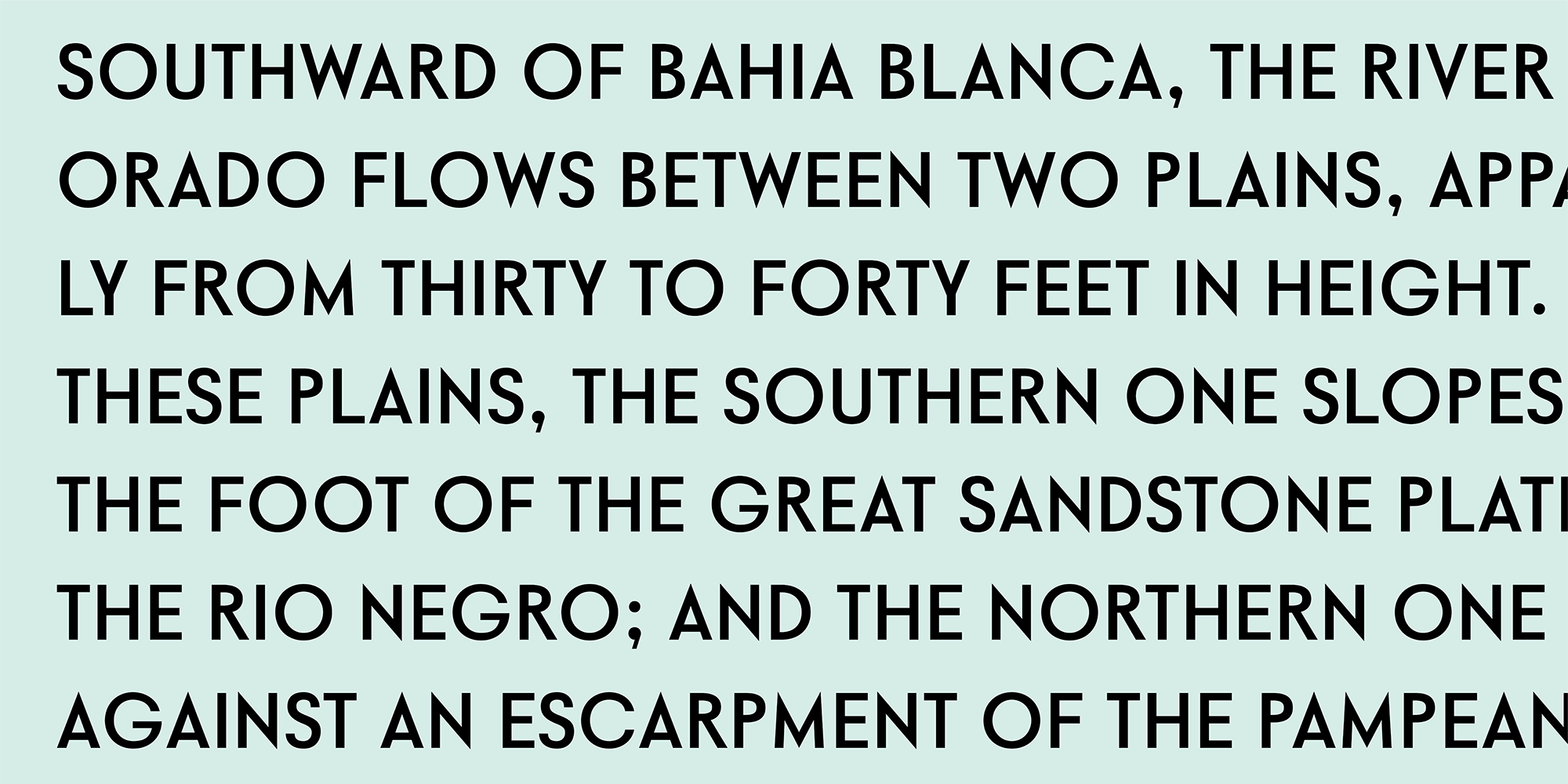
It was on the dark side of twilight when we got to Bistritz, which is a very interesting old place. Being practically on the frontier--for the Borgo Pass leads from it into Bukovina--it has had a very stormy existence, and it certainly shows marks of it. Fifty years ago a series of great fires took place, which made terrible havoc on five separate occasions. At the very beginning of the seventeenth century it underwent a siege of three weeks and lost 13,000 people, the casualties of war proper being assisted by famine and disease.
Gallery
1–2 / 11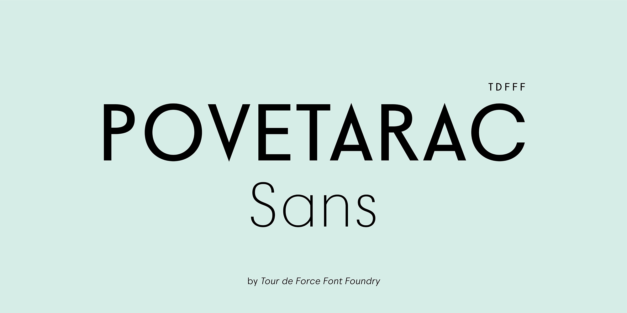
Alphabet
ABCDEFGHIJKLMNOPQRSTUVWXYZabcdefghijklmnopqrstuvwxyz
Glyphs
Click a glyph to inspect
Language Support
Latin Extended102 languages
Albanian
Alsatian
Aragonese
Arapaho
Aromanian
Arrernte
Asturian
Aymara
Basque
Bislama
Bosnian
Breton
Cebuano
Chamorro
Cheyenne
Cimbrian
Corsican
Croatian
Czech
Danish
Dutch
English
Estonian
Faroese
You might also like