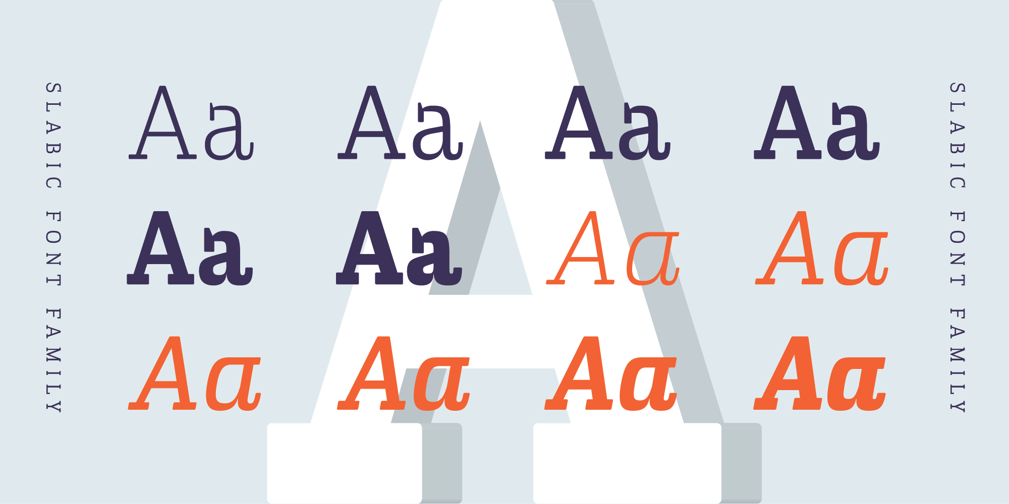
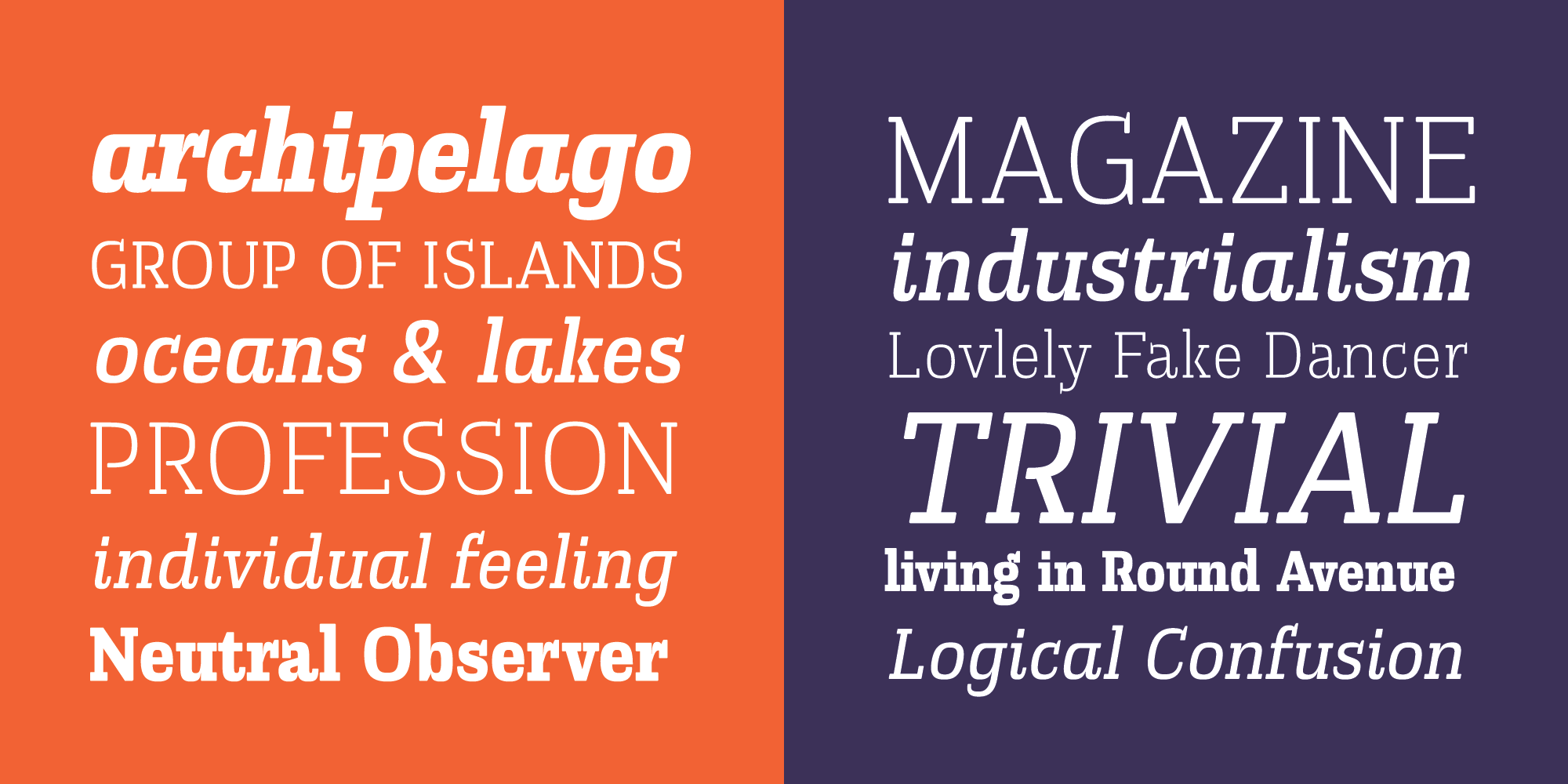
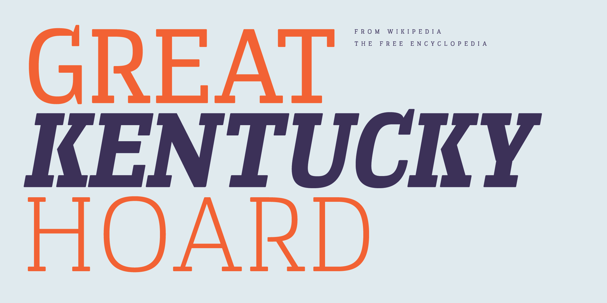
Slabic is modern slab serif font family available in 12 styles – 6 weights and 6 Italics.
from $30
or try a free style for testing →All Styles
Light
Light Italic
Regular
Regular Italic
Semi Bold
Semi Bold Italic
Bold
Bold Italic
Extra Bold
Extra Bold Italic
Black
Black Italic
Specimen
SizeS
LeadingL
TrackingT
S
L
T
De dos maneras puede representarse á los hombres.
SizeS
LeadingL
TrackingT
S
L
T
We are rising dizzily and fearlessly on the crest of a great wave of sentiment.
SizeS
LeadingL
TrackingT
S
L
T
This query is hard to answer.
SizeS
LeadingL
TrackingT
S
L
T
Mr. Chesterton, upon whom the delight of startling his readers never seems to pall, has declared that men are more sentimental than women, “whose only fault is their excessive sense.”
SizeS
LeadingL
TrackingT
S
L
T
You would not go into service, I suppose?
Paragraphs
S
L
S
L
She was golden, from the hair wound and braided so smoothly about her head, to the gold kid slippers on her small and fragile feet. Her dress, of some soft, glistening, silky stuff, was a deeper shade of the same gold, her soft, delicate skin seemed almost to be touched with a faint, powdery, golden dust. He failed to register, and never could recall, the color of her eyes. Perhaps, they were golden, too.
S
L
S
L
This completed, the agent hurries on, each day a constant round of contracts. A single item may bring its difficulties: suppose, in the year that has passed since his last visit, the usual show grounds has been cut up into building lots! He must find another, fully five hundred feet square, fairly level, rentable at a reasonable price, not too far from the center of town and easily reached by main trunk car lines. It isn't easy. But he does it.
S
L
S
L
Ben Holt was a poor boy, and at the time when he first gained his good name, he had never seen such a thing as a green field in the country. As to buttercups and daisies, they would have been looked upon quite as "treasures of silver and gold" by the little boy who had lived all his life in a London alley. This alley was so narrow, that the utmost he could see even of the blue sky of heaven was a small strip between the two rows of tall, dirty houses, which were so close together that a person living at one side of the alley could almost shake hands with his opposite neighbour from their respective windows.
S
L
S
L
I have data upon data upon data of new lands that are not far away. I hold out expectations and the materials of new hopes and new despairs and new triumphs and new tragedies. I hold out my hands to point to the sky—there is a hierarchy that utters me manacles, I think—there is a dominant force that pronounces prisons that have dogmas for walls for such thoughts. It binds its formulas around all attempting extensions.
S
L
S
L
It was on the dark side of twilight when we got to Bistritz, which is a very interesting old place. Being practically on the frontier--for the Borgo Pass leads from it into Bukovina--it has had a very stormy existence, and it certainly shows marks of it. Fifty years ago a series of great fires took place, which made terrible havoc on five separate occasions. At the very beginning of the seventeenth century it underwent a siege of three weeks and lost 13,000 people, the casualties of war proper being assisted by famine and disease.
Gallery
1–2 / 13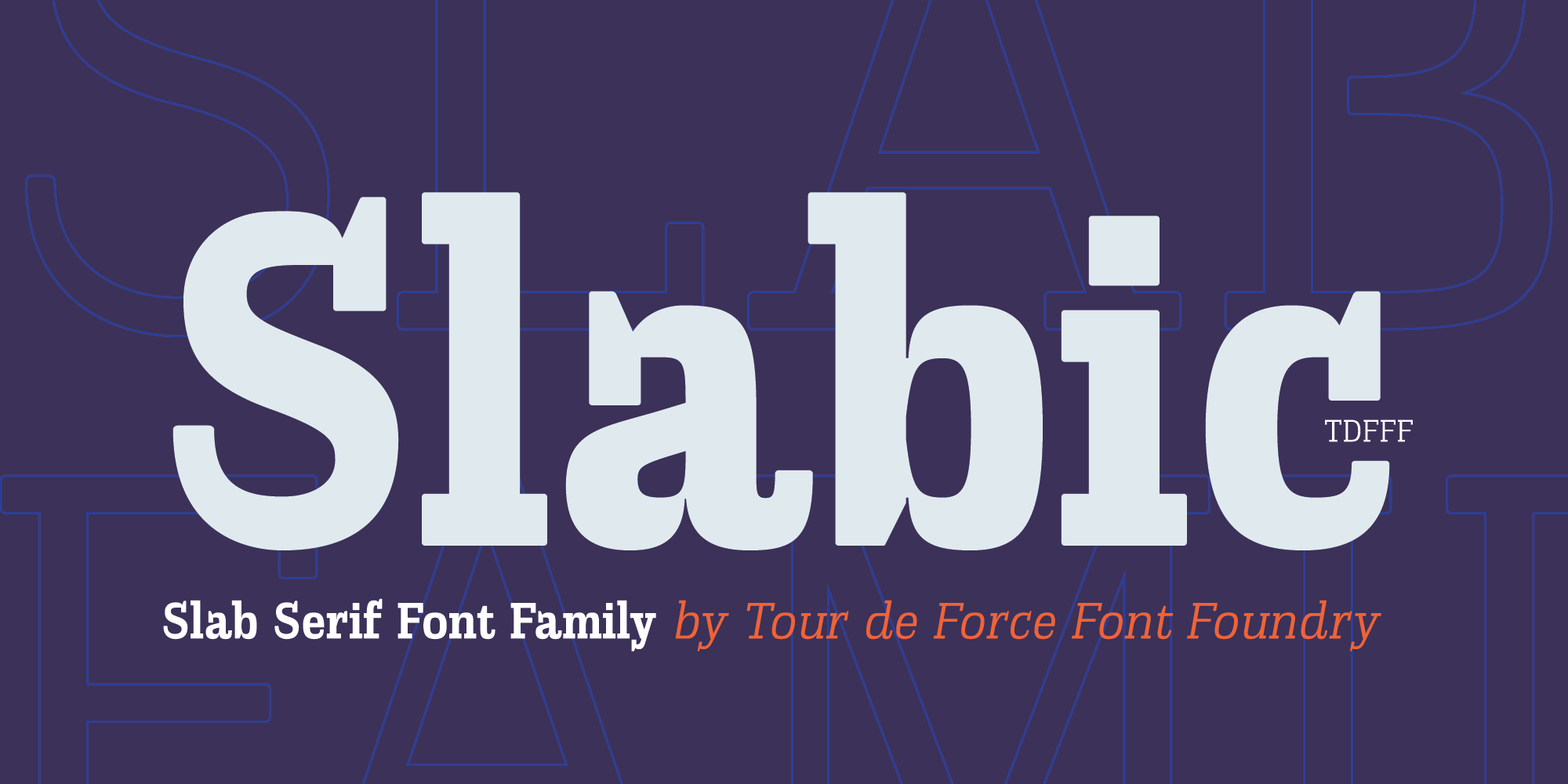
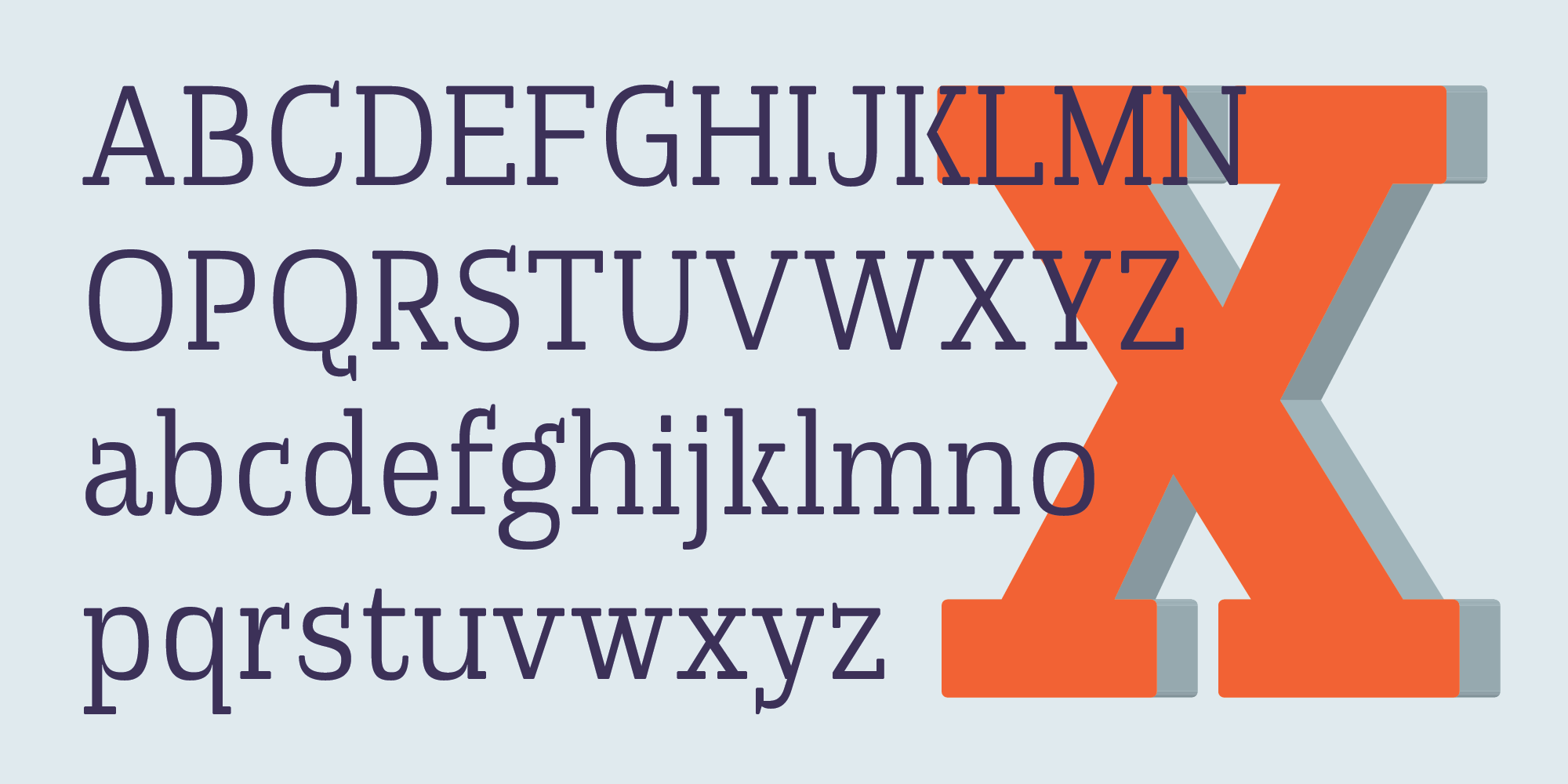
Alphabet
ABCDEFGHIJKLMNOPQRSTUVWXYZabcdefghijklmnopqrstuvwxyz
Glyphs
Click a glyph to inspect
Language Support
Latin Extended102 languages
Albanian
Alsatian
Aragonese
Arapaho
Aromanian
Arrernte
Asturian
Aymara
Basque
Bislama
Bosnian
Breton
Cebuano
Chamorro
Cheyenne
Cimbrian
Corsican
Croatian
Czech
Danish
Dutch
English
Estonian
Faroese
About Slabic
Slabic is modern slab serif font family available in 12 styles – 6 weights and 6 Italics.
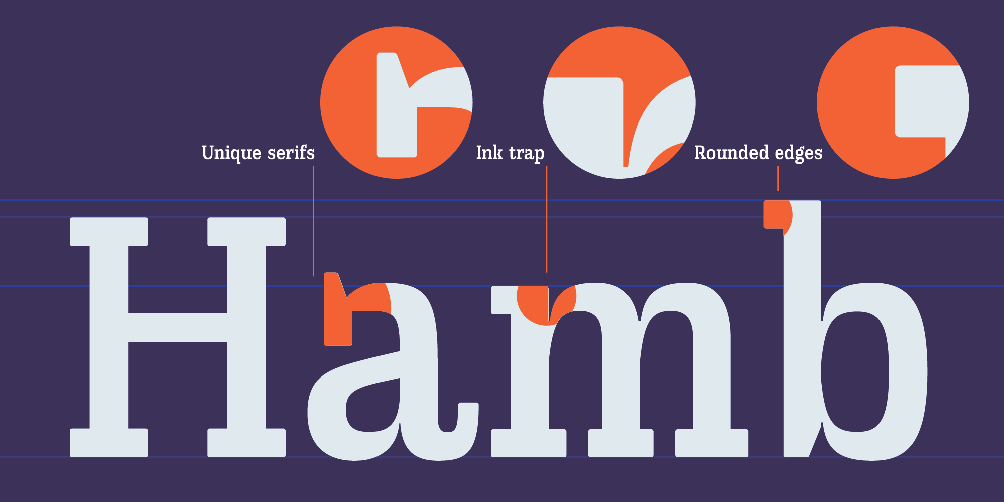
It's main characteristics are gently rounded edges, unique serifs and ink traps combined with slightly condensed width of letters. In lighter weights Slabic is more generously spaced while spacing gets more and more tighter to darker weights. Looks and feels compact, harmonized and visually balanced, so readers flow don't get interrupted during reading.
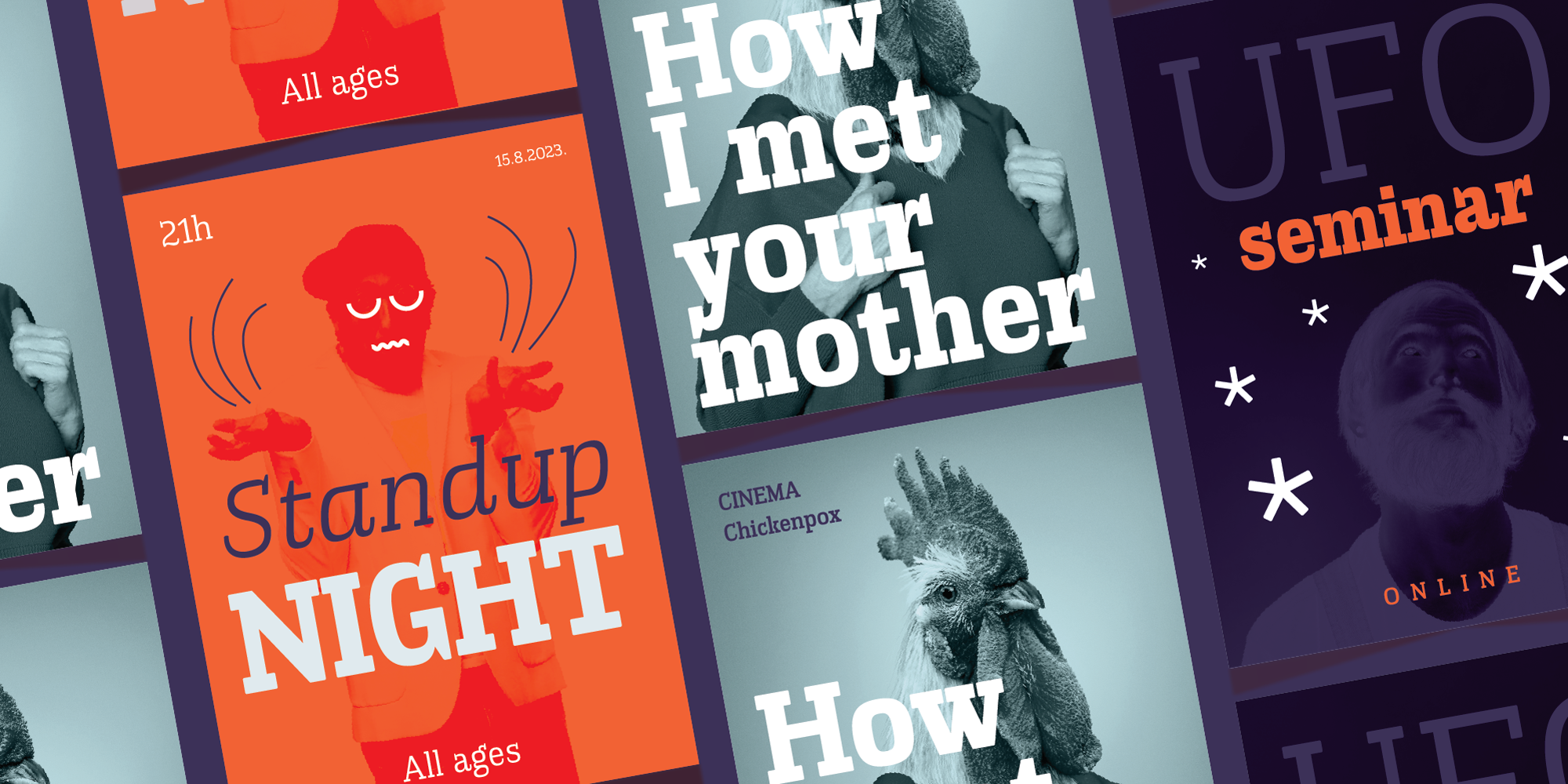
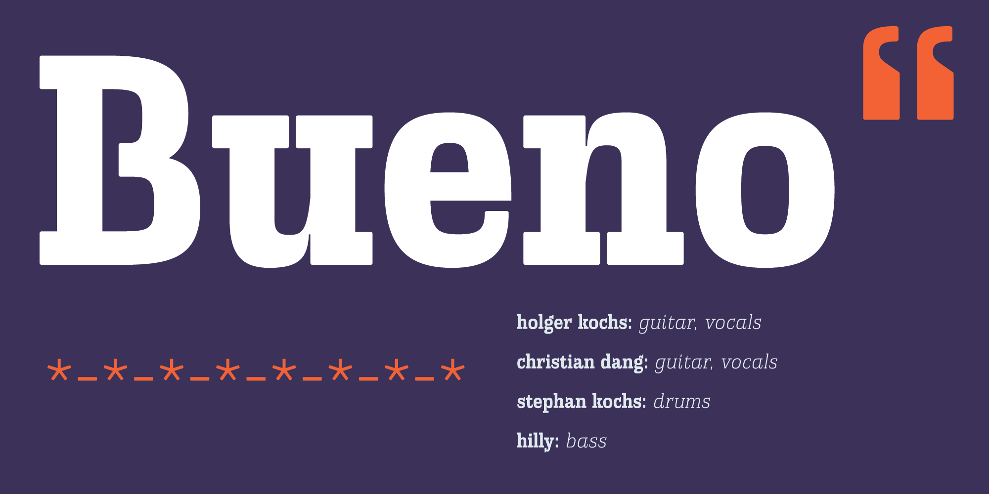
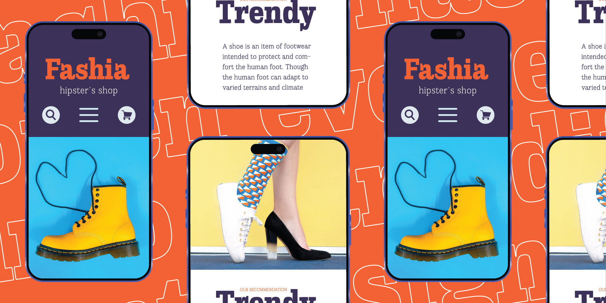
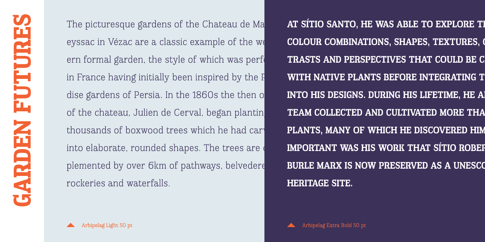
With it's features, Slabic recommends itself for editorial use or main body webfont. It looks good in big sizes which is suitable for logos, package design and posters. Works equally successful in small and big sizes.
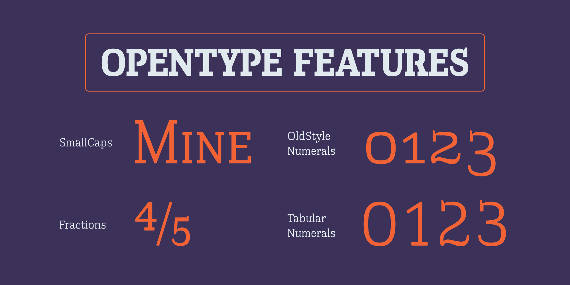
Slabic contains Small Caps, Fractions, Tabular and Old Style Numerals as Open Type features. Supports extended Latin character map.
Yeah, I made this!

Designer
Dušan Jelesijević
Released
01 August 2023
Version
v2.000
Classification
Slab Serif
Styles
12 styles
Languages
102 languages
You might also like