A typeface by
Dušan Jelesijević
Sans serif and display, in one familyEight weightsA hundred and four languagesWide, heavy, calm at small sizes
Sans serif and display, in one familyEight weightsA hundred and four languagesWide, heavy, calm at small sizes
Saga
Ember
Tale
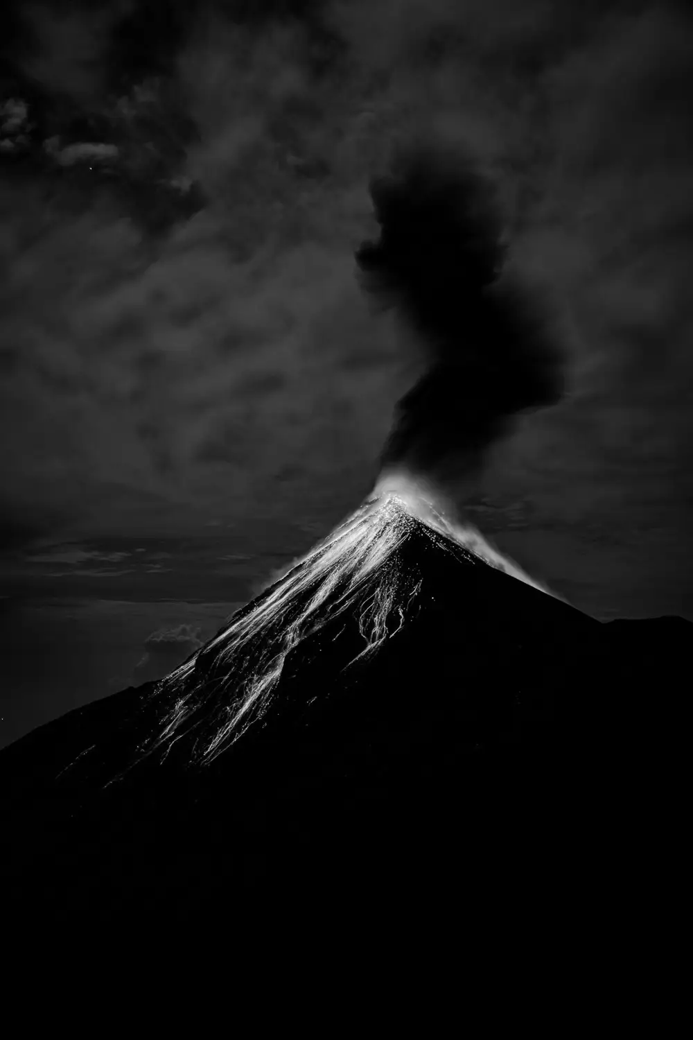
Hero
Epopeya is the Spanish word for epic
Built wide so it can be read from across a street.
Epopeya is a very wide, heavy grotesque. It sits between the sans serif and display categories: calm enough for a short paragraph, loud enough for a shop front. The wide letters need little help to fill a line, and the open counters keep the heavy weights from turning into blobs.
It comes in eight weights from Extra Light to Black, all with the same wide stance, so a single family can carry a caption, a headline and a poster without changing typeface.
Opera
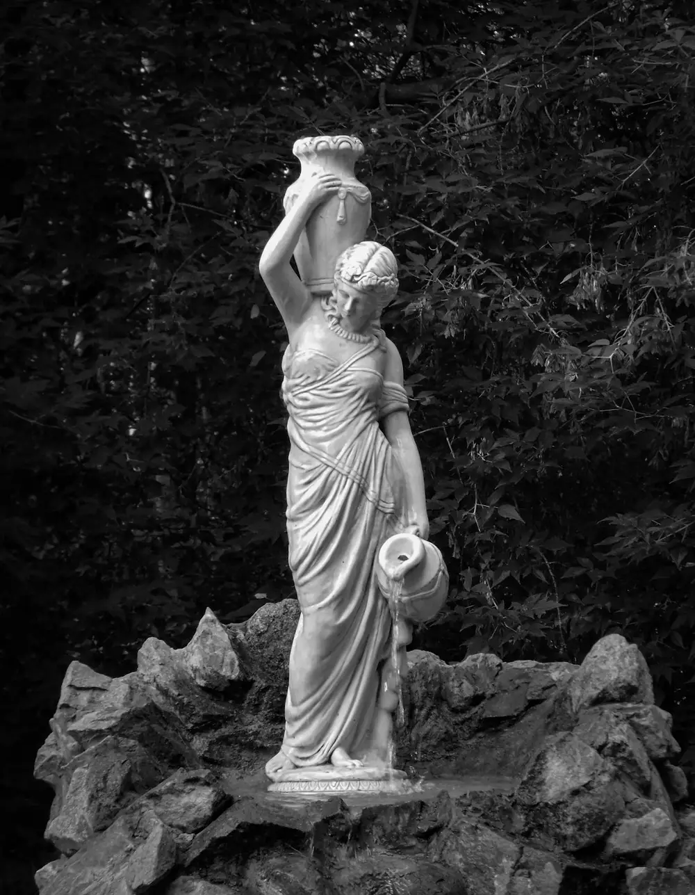
Bravura
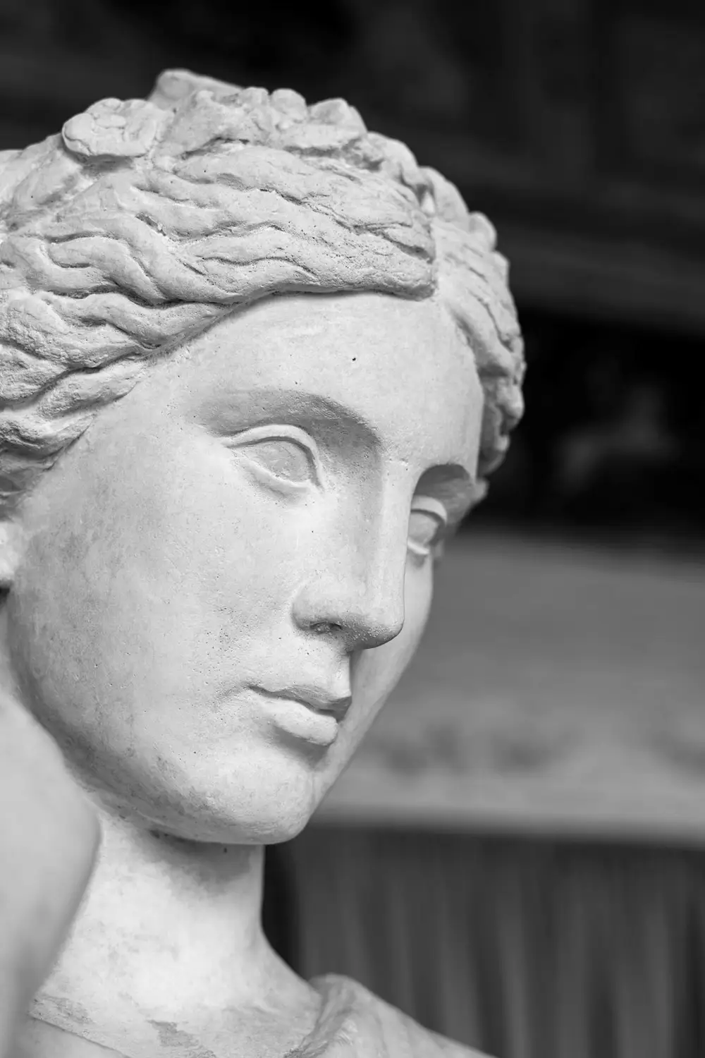
Anthem
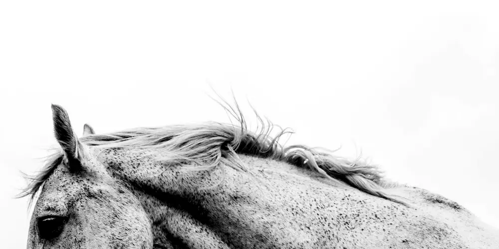
Fable
Coast
Capitals only
CAPITALS
WIDE
Eight weights, one wide stance
HEAVY
Open counters, even at Black
ÀÉÎÕÜ ČĆŠŽĐ ŁŃŚ
Accents on capitals, set to the same weight as the letter
Epopeya Extra Light200 · — px
Cities at first lightEpopeya Light300 · — px
Salt on the harbour wallEpopeya Regular400 · — px
A long road to the coastEpopeya Medium500 · — px
Bread, olives, strong coffeeEpopeya Semi Bold600 · — px
Doors open at eightEpopeya Bold700 · — px
The last train southEpopeya Extra Bold800 · — px
Loud, bright, fearlessEpopeya Black900 · — px
Big sky over the sea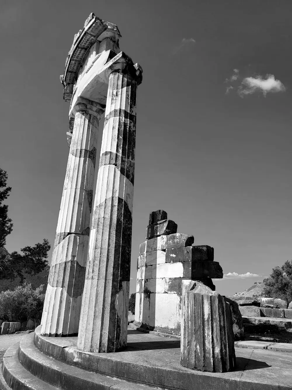
Epic
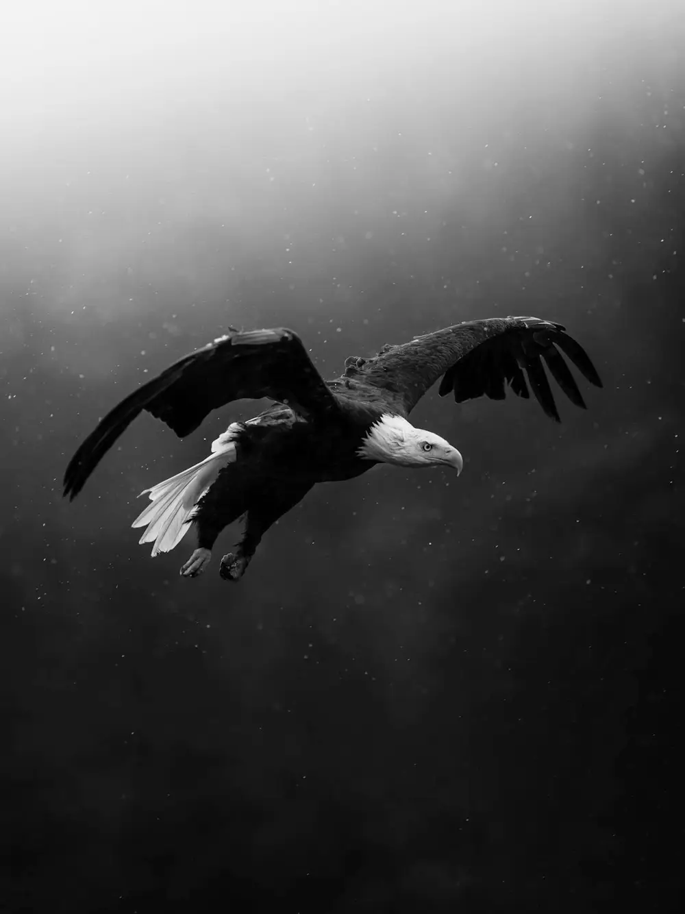
Eagle
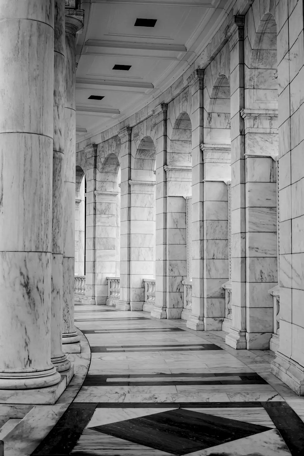
Hall
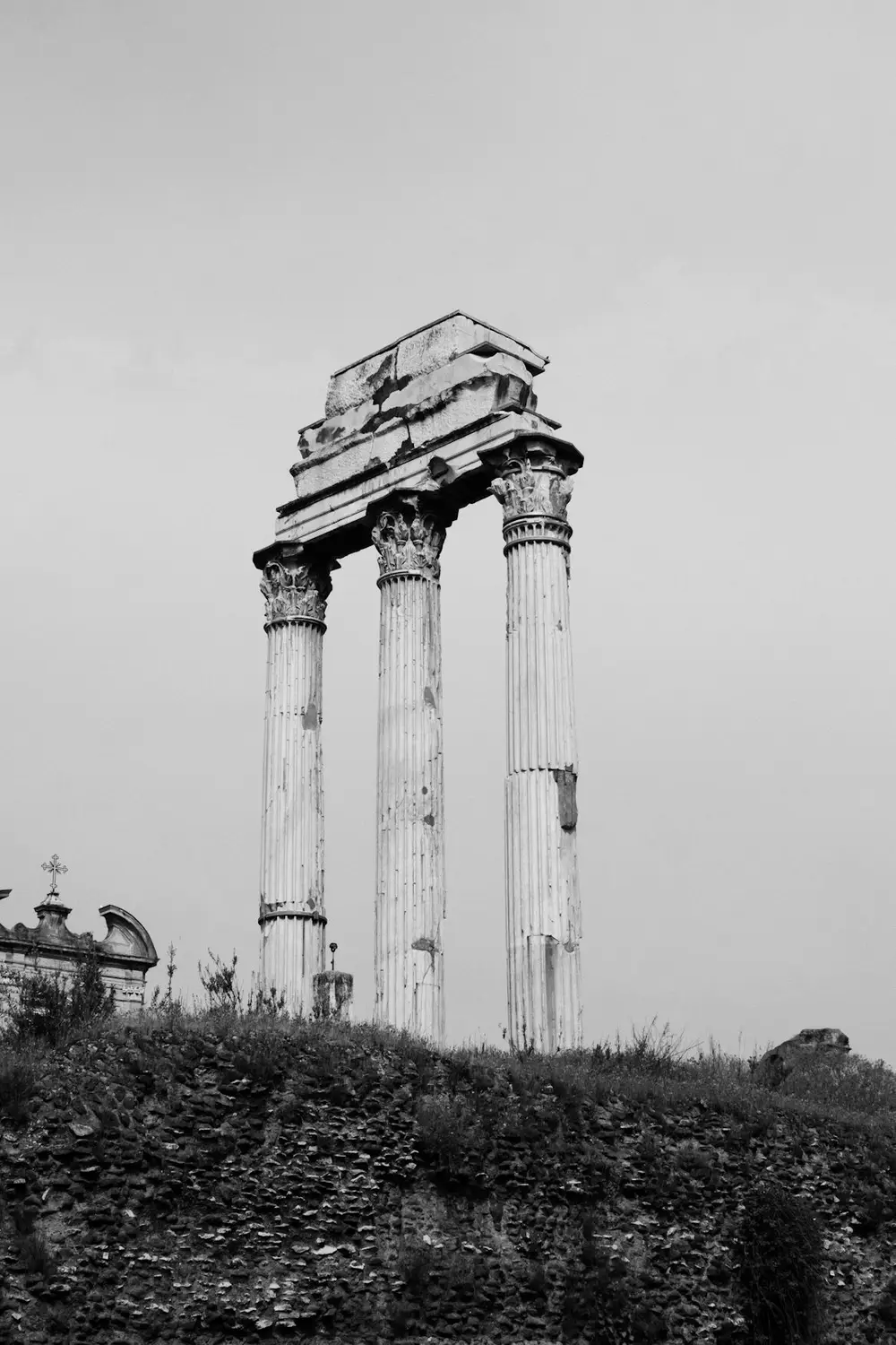
Ruins
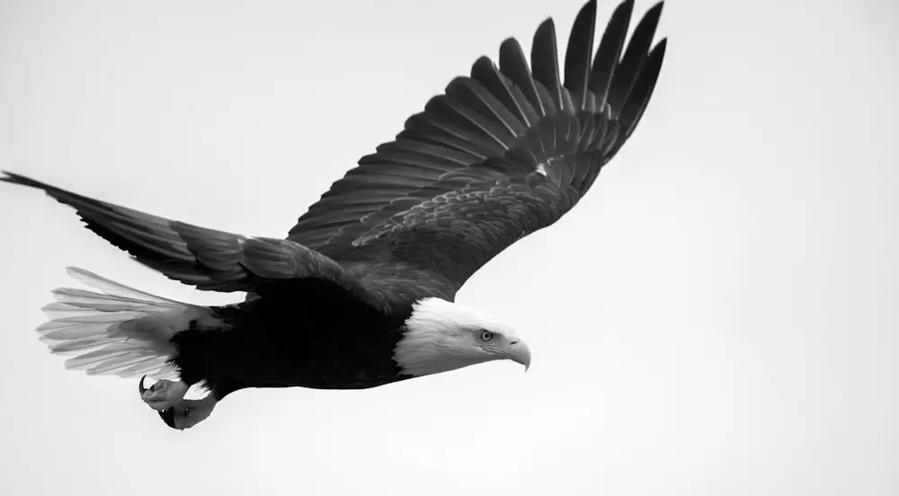
Flight
Set it large
Epopeya is at its best from about forty points up. The wide, heavy letters need space, so give a headline the whole width of the page instead of squeezing it into a narrow column.
Give it room
Wide letters want generous margins and line spacing. Set lines tight only when they are short, a word or two, and let anything longer breathe.
Pair it quietly
Next to Epopeya, a plain and narrower text face works well. Let the heavy weights do the shouting and keep the running copy calm.
Weights, not styles
Extra Light against Black in one line gives contrast without a second typeface. The family has no italics, so emphasis comes from weight or from size.
Languages
0
Latin-script languages. The full list is further down the page, next to the weights.
Weights
0
Extra Light to Black. The thin weights keep the same wide stance, so a family can run from a caption to a billboard.
Family
0
One drawing, one width. No condensed or italic cuts, so every line you set looks like it belongs with the rest.
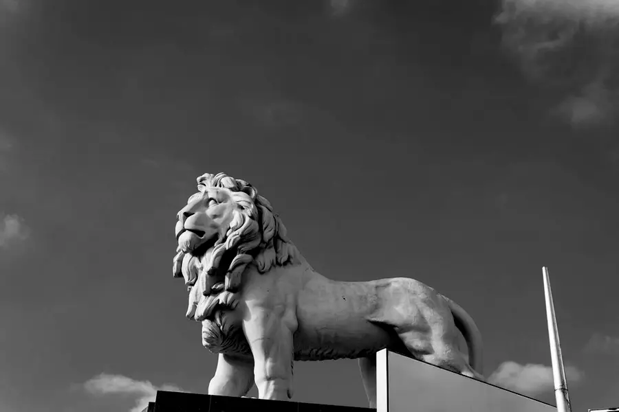
Pride
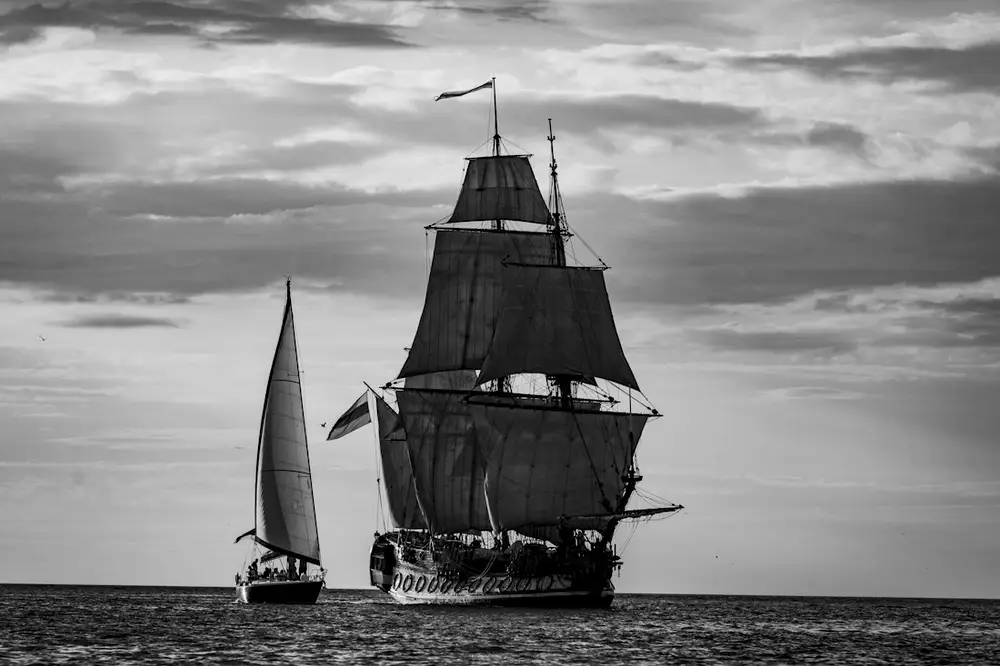
Voyage
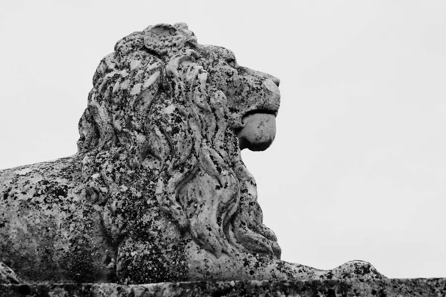
Crest
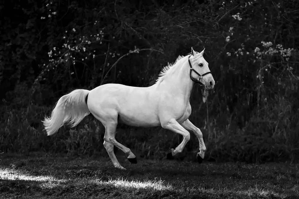
Rider
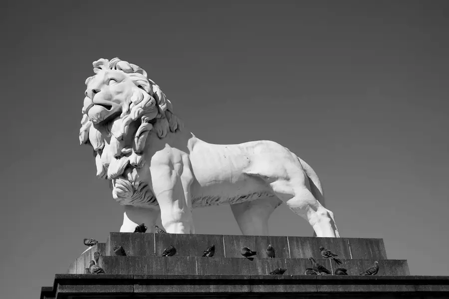
Stride
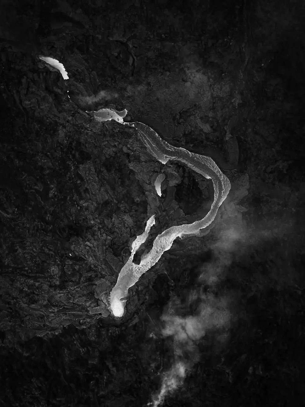
Fire
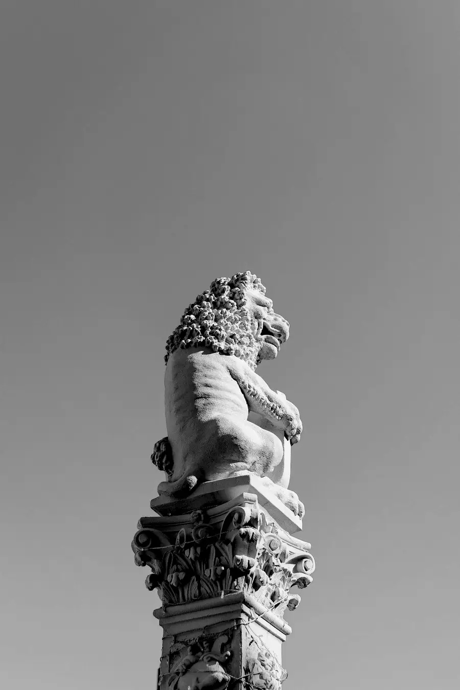
Pillar
Pride
Voyage
Crest
Rider
Stride
Fire
Pillar
A wide face for big, loud ideas.
140px · Black
Every glyphU+0067
Black
Sans serif and display
Wide, heavy and still open.
Epopeya font family is mixture of sans serif and display categories that comes in 8 weights.
By its design, it's wide, compact, stable font family with a lot of unique characteristics. It relies on geometric sans basis which was further developed to make Epopeya distinct and still fully usable in all classic situations where you're required for sans serif font family.
Contains Extended Latin character set with Standard Ligatures as OpenType features.
Languages
104
Albanian · Alsatian · Aragonese · Arapaho · Aromanian · Arrernte · Asturian · Aymara · Basque · Bislama · Bosnian · Breton · Cebuano · Chamorro · Cheyenne · Cimbrian · Corsican · Croatian · Czech · Danish · Dutch · English · Estonian · Faroese · Fijian · Finnish · French · French Creole (Saint Lucia) · Frisian · Galician · Genoese · German · Gilbertese (Kiribati) · Greenlandic · Haitian Creole · Hiligaynon · Hmong · Hopi · Hungarian · Ibanag · Icelandic · Iloko (Ilokano) · Indonesian · Interglossa (Glosa) · Interlingua · Irish (Gaelic) · Istro-Romanian · Italian · Jèrriais · Kashubian · Kurdish (Kurmanji) · Ladin · Lojban · Lombard · Low Saxon · Luxembourgian · Malagasy · Manx · Mohawk · Norfolk/Pitcairnese · Northern Sotho (Pedi) · Norwegian · Occitan · Oromo · Pangasinan · Papiamento · Piedmontese · Polish · Portuguese · Potawatomi · Rhaeto-Romance · Romansh (Rumantsch) · Rotokas · Sami (Lule) · Samoan · Sardinian (Sardu) · Scots (Gaelic) · Seychellois Creole (Seselwa) · Shona · Sicilian · Slovak · Slovenian (Slovene) · Somali · Southern Ndebele · Southern Sotho (Sesotho) · Spanish · Swahili · Swati/Swazi · Swedish · Tagalog (Filipino/Pilipino) · Tetum (Tetun) · Tok Pisin · Tswana · Turkmen · Turkmen (Latinized) · Uyghur Latinized) · Veps · Volapük · Votic (Latinized) · Walloon · Warlpiri · Xhosa · Yapese · Zulu
Eight weights
- Extra Light200
- Light300
- Regular400
- Medium500
- Semi Bold600
- Bold700
- Extra Bold800
- Black900
Designer
Dušan Jelesijević
Released January 2026. 8 weights, sold singly from $30, or the whole family for 192.
Buy EpopeyaEpopeya
Designer
Dušan Jelesijević
Released
January 2026
Set in
8 weights, 104 languages